
Produced & Written by Dan Burge | 6 November 2026
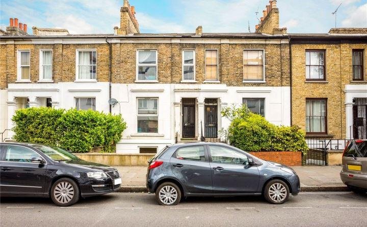
Plaster House sits in a row of Victorian terraces on a busy market street in Hackney, East London, and gives almost nothing away from the pavement. Inside, a one-bedroom ground-floor flat that still had its kitchen outrigger and an outside toilet has become a two-bedroom home opening onto a landscaped tropical garden, with an award-winning studio at the far end of the plot.
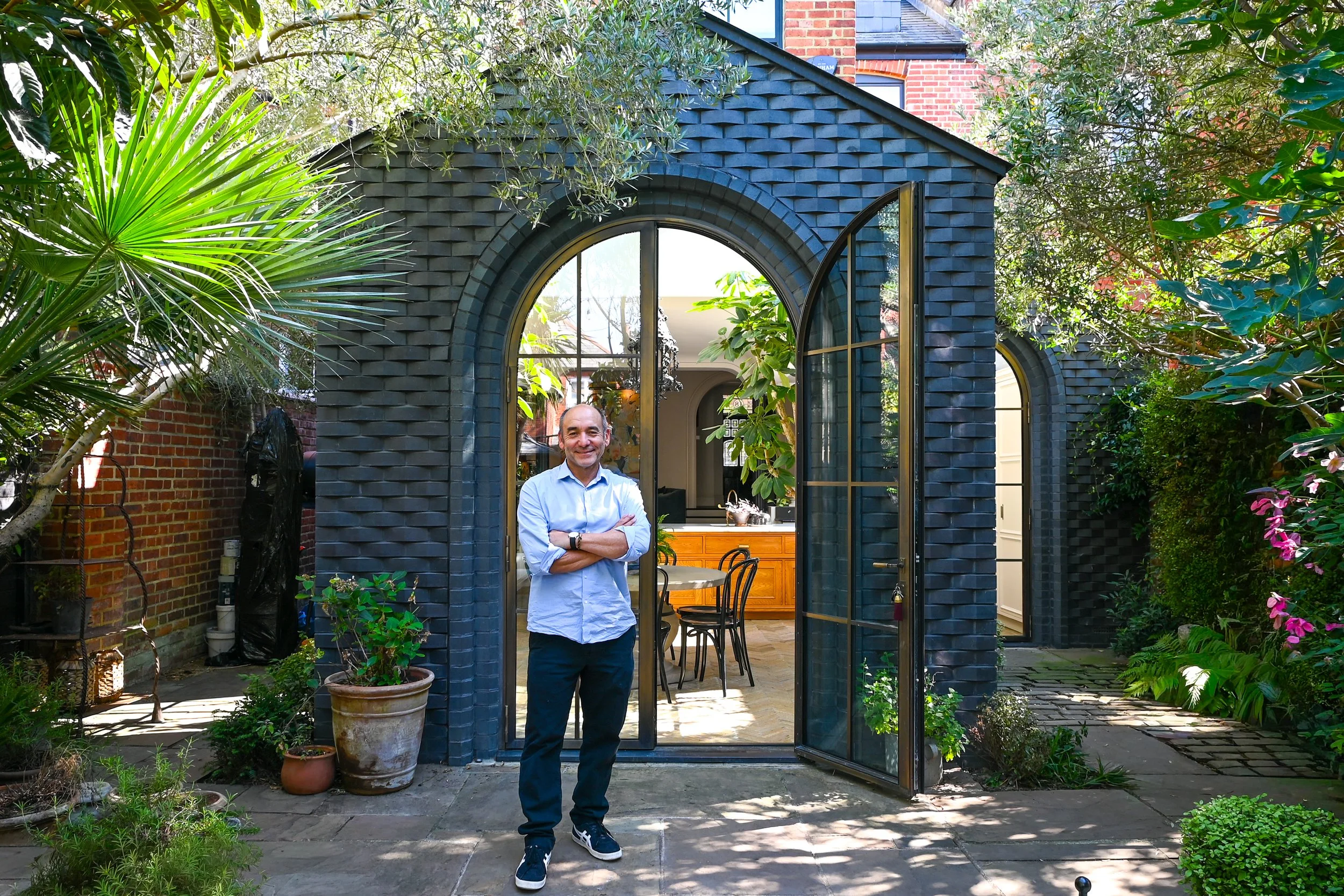
It belongs to architect Tim Robinson of Sonn Studio, who designed the architecture, interiors, joinery and furniture as one piece of work, then built a large part of it himself. The main contractor took the house to shell and stopped there. Everything after that point - the kitchen, the bathroom, every bench, cupboard and worktop - Tim and his partner fitted out themselves while living in the studio at the bottom of the garden.
We filmed a full tour with Tim earlier this year, walking the project from the garden building that came first through to the main bedroom. What follows is how a cheap developer conversion became a home designed to feel as though it had been carved out of stone.
The Property
A Cheap Conversion with an Outside Toilet
Tim and his partner bought the flat in 2018. At that point it was a one-bedroom ground-floor conversion that still had its original kitchen outrigger and an outside toilet, and the condition was poor throughout. It had been carved out of a larger house and turned around at speed by a developer looking to sell, which left a long run of cheap fixes and basic detailing behind it. "It had kind of been done cheaply and quickly by a developer to sell it, so there was a lot of very basic fixes and features," Tim says. Nothing about the layout had been considered beyond getting the property to market.
The Garden Nobody Could Reach
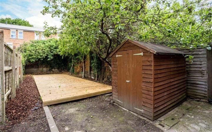
What made the flat worth buying was behind it. The garden ran somewhere between ten and fifteen metres, which is a rare amount of outside space for a terrace on a market street in Hackney, and it was doing nothing for the house. The developer had put the living room at the front of the property and the bedroom at the back, a decision that makes sense if you are thinking only about street noise, but one that left the main living space with no relationship to the garden at all. You could see the garden from the bedroom. You could not use it from anywhere you actually spent time.
Flipping the Plan
The first strategic move was to reverse that arrangement entirely: bedroom to the front, living space to the back, with the kitchen, dining area and seating all pushed towards the garden. "That was something we really wanted to promote," Tim explains, "actually getting away into this kind of oasis at the back of the house, rather than the main living space being at the front of the property." It is a simple swap on paper and it changes the whole experience of the flat, because the room you occupy for most of the day now looks out at the apple tree rather than at the pavement. Everything that followed — the extension, the sightlines, the sunken seating, the studio at the end of the plot — depends on it.
Front Elevation (Before)
Rear Garden (Before)
The Garden Studio and Hidden Workshop
A Building with Several Jobs
Rather than beginning with the house, Tim started at the bottom of the garden. Planning permission came through in 2019 and the brief was deliberately loose: a workshop, a party space, somewhere to do yoga, a spare bedroom when people stayed. The question at the time was whether it would get used enough to justify building it, which looks almost funny in hindsight, because it was finished just as the country was told to work from home. "Obviously COVID hit in 2020 and we realised that we need to use this every single day," Tim says.
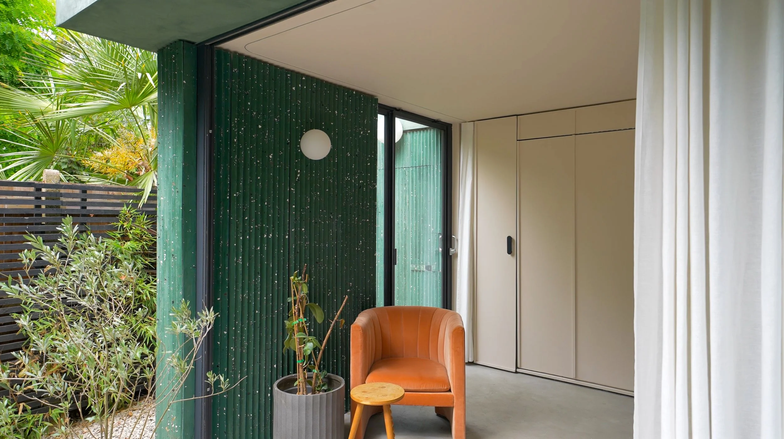
Terrazzo, Mirrors and a Bed in the Wall
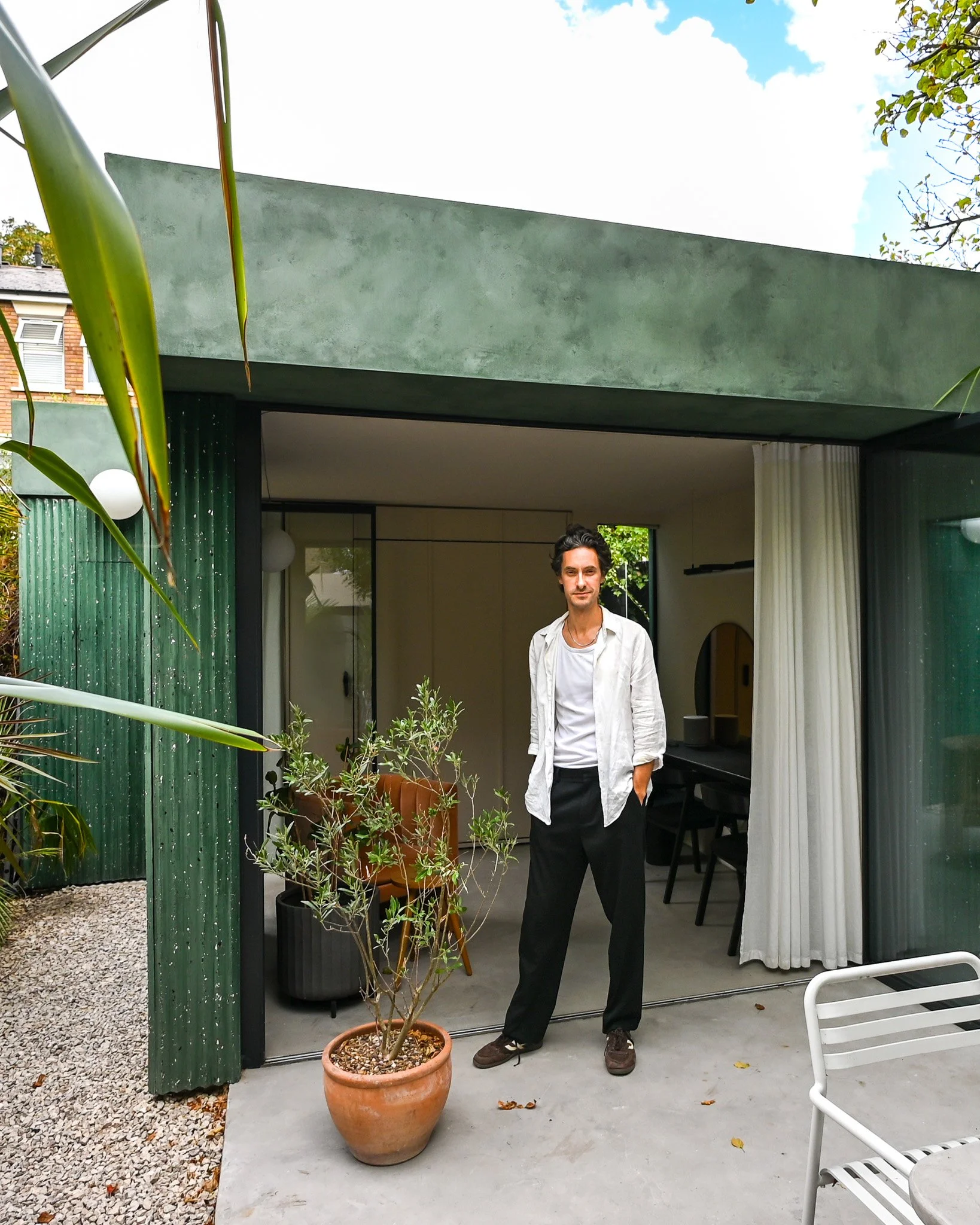
The form came out of a design and research trip to Mexico, and the reference people reach for is a cabana: a covered roof on a spine wall with the space below opening up completely. Full-height sliding doors fold right back and the light grey micro-cement floor runs from inside to outside without a threshold, while mirrors along one wall play with how deep the building feels — "your perception of how far or how deep the actual space is," as Tim puts it, "makes it feel even bigger than it actually is". A bespoke forest green terrazzo cladding wraps the building and continues inside, with a green textured render above, and tropical planting overhangs the white gravel path to the door. Inside, a stained cork desk runs the full length of one wall with glazing to either side, and the joinery conceals a bed that folds down out of the wall and linen curtains that pull from a hidden slot, turning the studio into a guest bedroom in about a minute.
The Workshop
Behind the studio is a second room most visitors never notice. Tim does a lot of building and making, particularly joinery, and wanted a proper workshop without giving half the garden over to something that looks like a shed, so the cladding wrap continues straight across the door and there is no visible opening at all. "I really was keen to have a workshop space, but something which was hidden away and wasn't an obvious space," he says. Inside, a large rooflight keeps it workable all day and a water butt on the side of the building collects rainwater for the sink. It is also the one place the palette turns loud, with a red cast worktop and a terracotta red bench — "a real surprise pop of colour, hidden behind the secret door in the workshop".
The Extension: Carved Out of Stone
Honest Materials, Monolithic Form
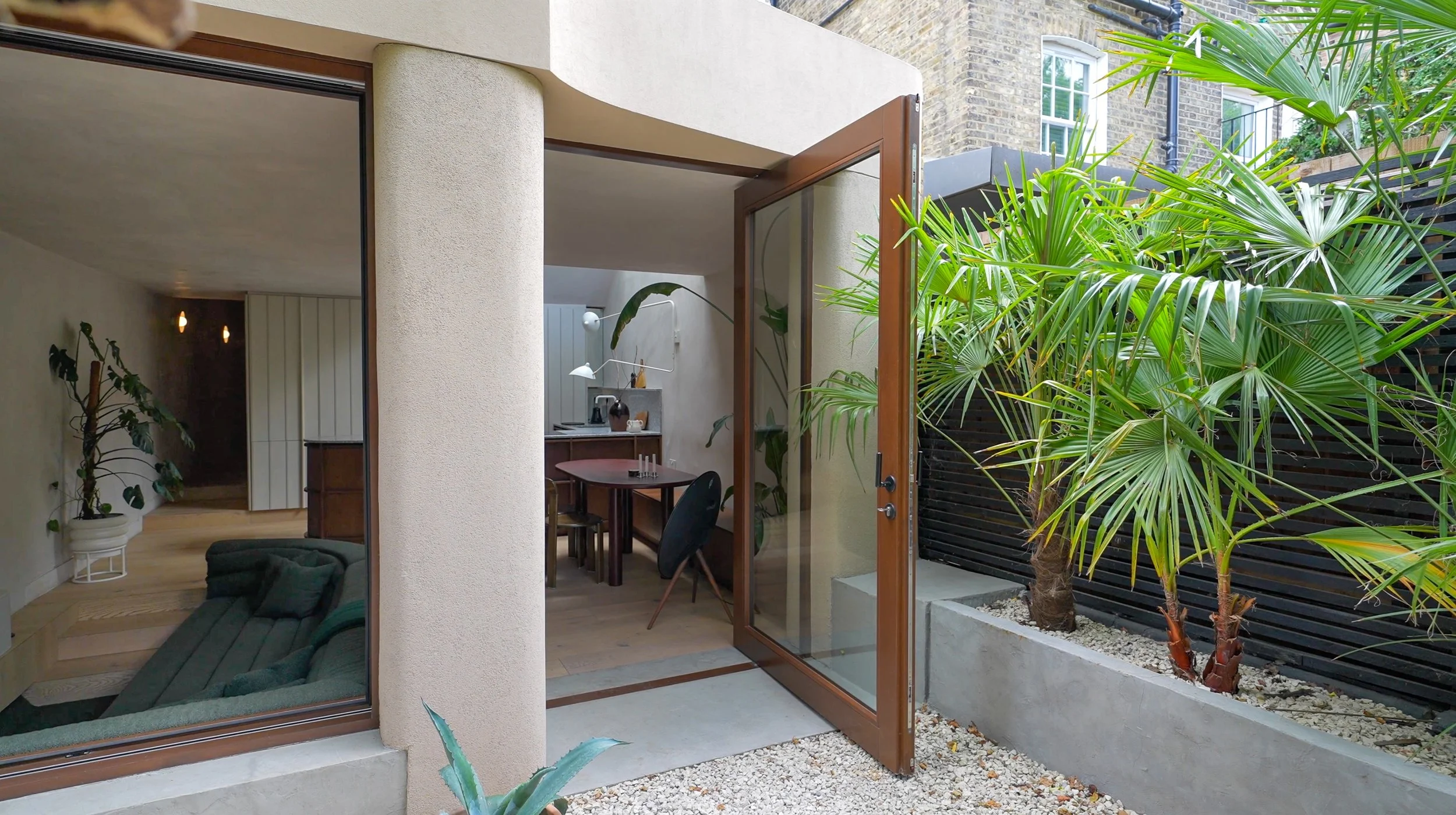
Sonn Studio's work leans consistently towards natural, organic materials used honestly, and Plaster House is where Tim applied that to his own home. The extension was designed to feel as though it had been carved out of a single block of stone — "quite a monolithic, heavy textured stone plaster type environment", in his words — achieved with a mix of roughcast and smooth render and plaster finishes that run internally and externally. The upper section reads as a heavy mass with sections cut away from it; the lower columns are treated separately, in a much rougher cast render, so the building appears to sit on a set of ribbed spine walls rather than on ordinary piers.
No Line Between Inside and Outside
Both textures continue through the openings into the house, which is the detail that makes the concept hold together. When the doors are open there is no point at which the exterior material stops and an interior finish begins — the rough cast columns are rough cast on both sides of the threshold, the smooth plaster above carries straight through, and the flooring runs flush out to the terrace. "There's never a strict cut line between inside and outside," Tim says. "Textures always pull inside as well." Planting is integrated into sections of joinery and the seating is set slightly forward of the opening, so the edge is never read as a single straight line.
The Rooflight the Builder Questioned
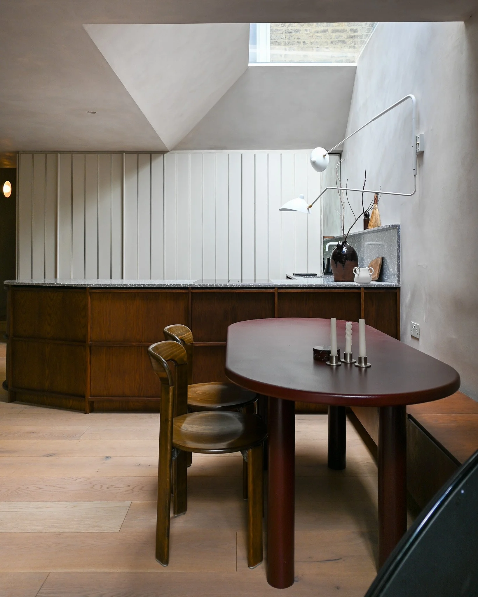
Above the kitchen is a large rooflight, and the way it meets the ceiling took some arguing for. Tim wanted the walls chamfered down to the glass so light would wash deeper into the plan rather than dropping straight down in a box. Achieving that angle cleanly meant specifying a rooflight considerably larger than the opening you see from inside, with the extra concealed within the ceiling build-up — a detail the contractor queried on the basis that if you want more light you simply fit a bigger rooflight. The finished angle pulls light much further back into the space than the visible aperture suggests it should. "Sometimes there were little bits where you have to trust your architect on ideas which might not feel the obvious thing to do," Tim says.
The Conversation Pit, Kitchen and Dining Space
Height Bought by Digging Down
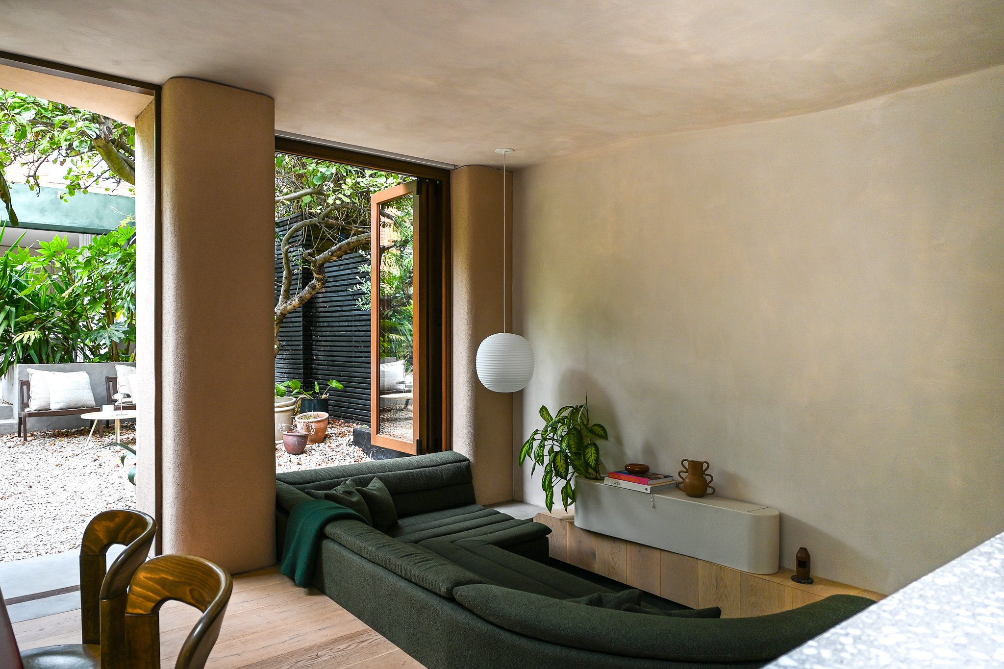
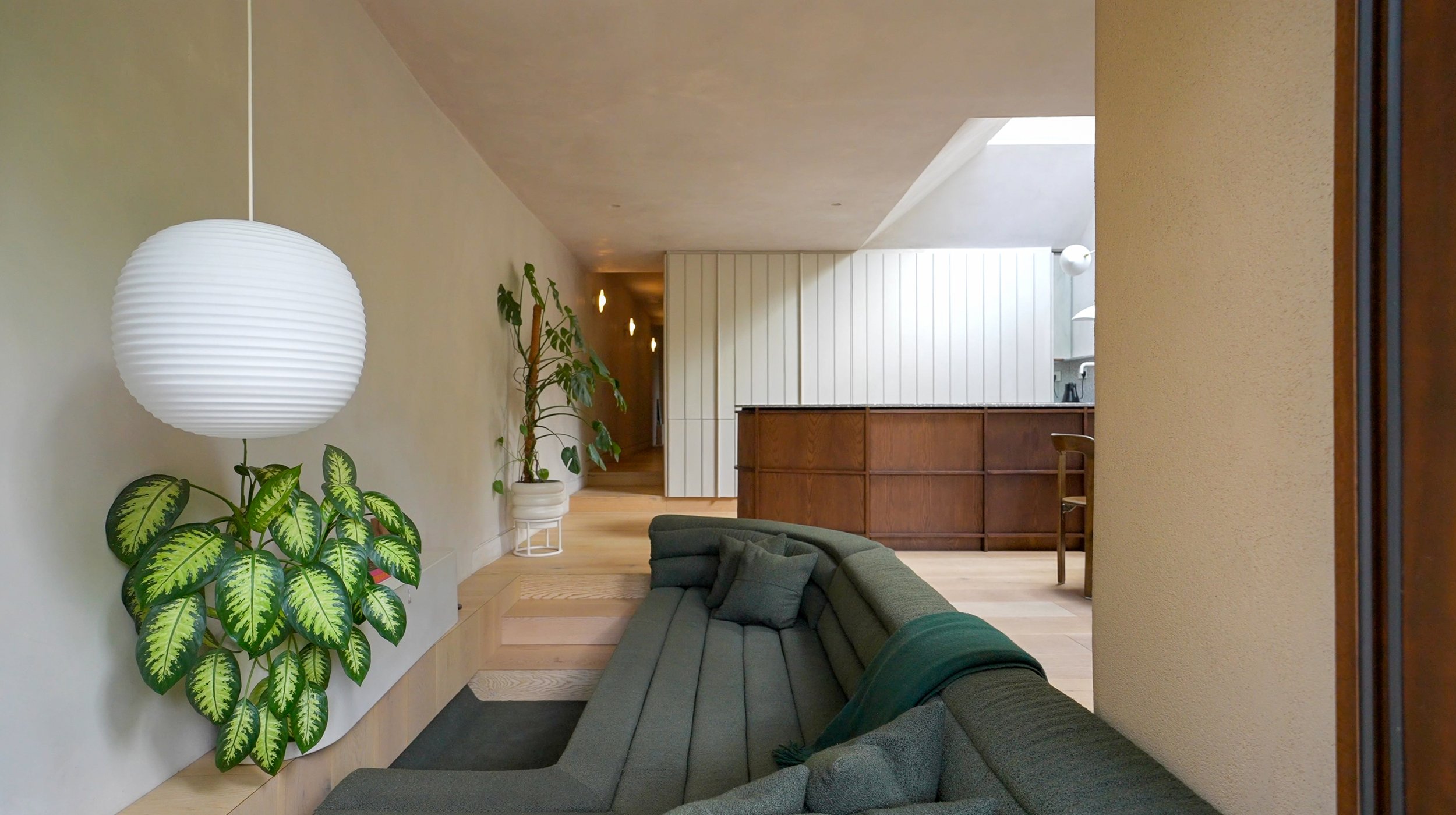
The single intervention Tim identifies as transforming the space is the sunken conversation pit. Dropping the seating below floor level buys ceiling height without going up, and in a ground-floor flat with a fixed roof line that is the only direction available. "The idea for the conversation pit was to give that increased feeling of height," he says. "It really makes the space feel a lot bigger." It was also the most technically awkward element in the build: sinking the floor meant underpinning the adjacent wall, and because the main sewer runs directly beneath that part of the house, the seating had to be detailed around a live drain — a constraint that is completely invisible in the finished room.
Sitting Under the Apple Tree
The conservation pit sits beneath an apple tree that was already in the garden, and the window beside it is the pay-off. "If you fold these windows back you can sit down there and it does feel like you're sat underneath this beautiful apple tree," Tim says. Low-level pendant lighting and dark stained oak around the pit give the arrangement a slightly nostalgic quality, somewhere between a 1970s sunken lounge and a covered terrace. The rest of the room is broken into pockets rather than one undifferentiated space, with a dining area and built-in bench seating set against the wall, so the open plan never reads as a single corridor of kitchen.
Stopping the Kitchen Announcing Itself
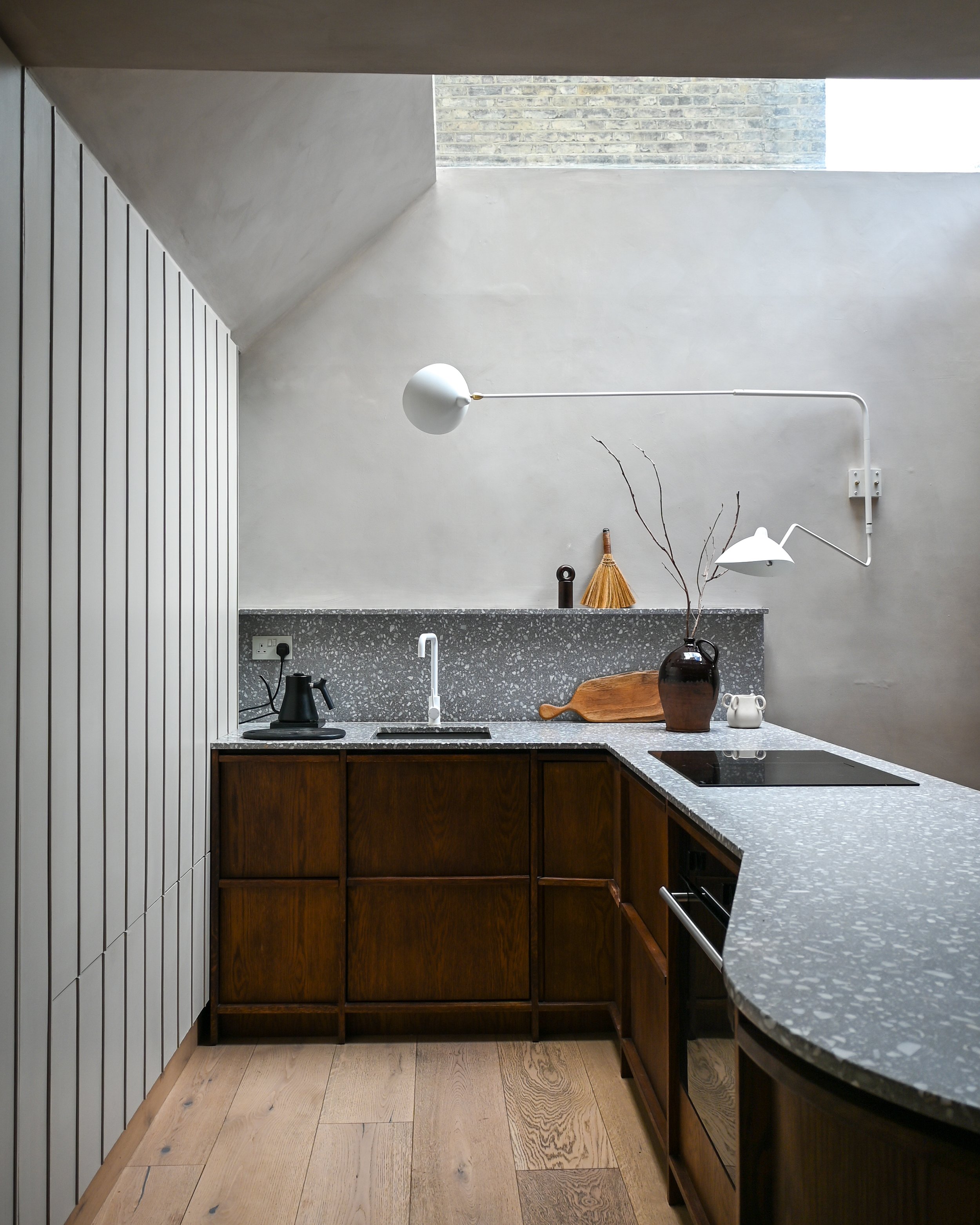
The space has to work as kitchen, dining room and living room at once in a footprint with no room to separate them, and the strategy was to stop the kitchen announcing itself. Painted hit-and-miss timber cladding on the back wall conceals the bulk of the equipment, and behind it a pantry opens or closes in sections, with a sliding door over the wine fridge. "I don't know why, but I don't like looking at wine fridges" Tim explains. The worktop is a grey terrazzo referencing the studio in a simpler, more neutral colour, set against stained dark oak units and lighter wide-panel oak flooring. Soft curves run through all of it — the peninsula, the columns, the dining table and even the handles, made chunky but rounded. "There's always soft curves, which make it feel a bit more organic," Tim says. "There's not harsh corners and harsh edges."
Hidden Details and Bespoke Joinery
Why People Read It as Minimalist
Visitors tend to describe the house as minimalist, which Tim gently pushes back on: "A lot of people say it feels quite minimalist, but a lot of it is just clever design features which really make the space actually work practically." Very little has been removed; it has been put away. A television rises out of the joinery when it is wanted and disappears when it is not. Wireless charging is set into the surface beside the conversation pit, so a phone can be left to charge without a cable crossing the room. Sockets are concealed underneath the units, close enough to work from but out of sight.
The Small Details You Would Never Notice
Some of the best moves in the house are the least glamorous. The worktop was extended very slightly over the sink so sponges and cloths can be stored out of sight and still drip away where they should — "things that you technically need every single day, but then you can hide them away". The mirror-fronted cabinet at the end of the kitchen wall slides from a slot cut into the joinery. Curtains throughout run on concealed tracks and can be pushed back into recesses within the cabinetry so they disappear entirely. None of these are expensive gestures and all of them address something that is genuinely used every day.
Planting Brought Inside
The inside-outside relationship is reinforced through the joinery as much as the architecture. Planters are integrated directly into sections of the cabinetry, so greenery appears inside the house rather than only beyond the glass. The flooring is flush and continues to the terrace in the same material used down at the studio, and the seating is deliberately shifted forward of the opening so the transition is not one uninterrupted straight line. They are small adjustments, but together they are the "elements that really help break up where the inside and outside kind of start".
HomeInspire Downloads
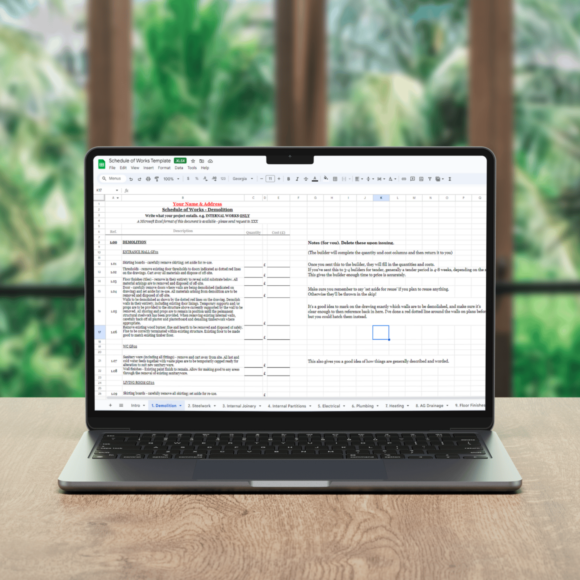
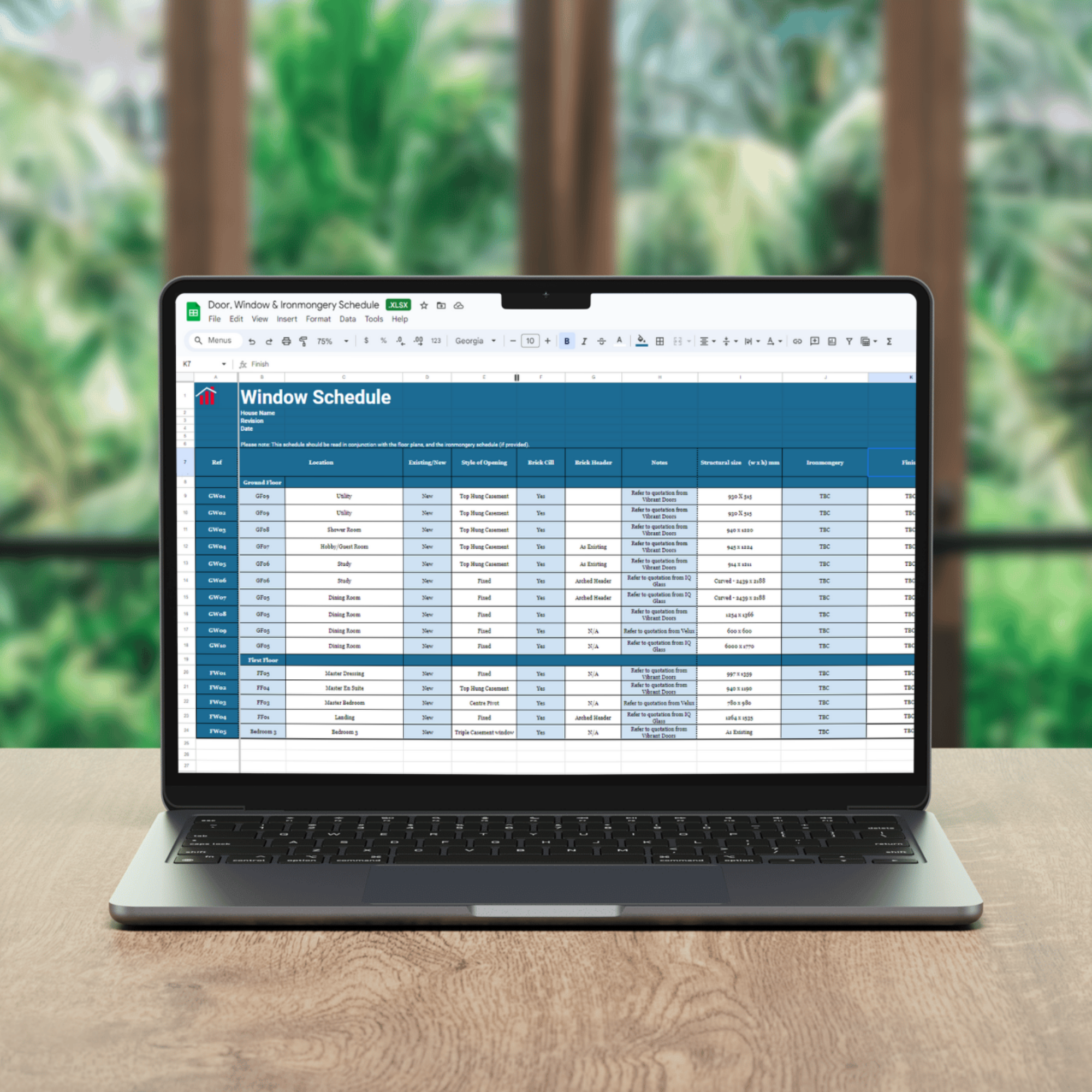
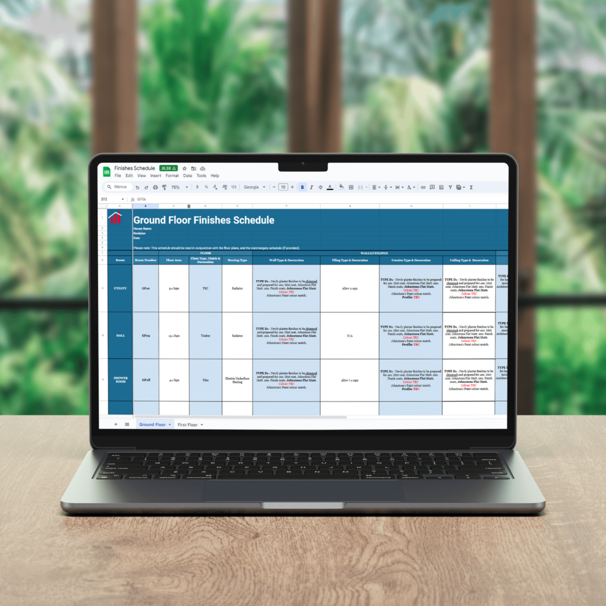
Download Our Complete Renovation Handbook
A step-by-step guide to planning, designing, and delivering your dream home.
Planning your first renovation doesn’t have to be overwhelming. This 62-page step-by-step eBook guides you through every stage - from budgeting and planning to design, permissions, and finishing touches. Packed with expert advice, checklists, and cost guides, it helps you avoid mistakes, stay on track, and bring your dream home to life.
Building It Themselves
The Contractor Took It to Shell
The main construction contract covered the structure and nothing beyond it. "The builder only took it up to the main shell," Tim says. "They left us with an empty shell that we had to fit out." The contractor delivered the extension, the main structural elements and the fabric of the house, and then handed over. Everything that turns a shell into a home — the kitchen, the bathroom, the pantry, the benches, the headboard, every piece of fitted joinery in both buildings — fell to Tim and his partner, primarily because the budget would not stretch to having it done.
Living in the Studio
That is where the sequencing of the project pays off. Because the garden studio had been built first, there was somewhere to live while the house was unusable, and the pair moved down to the bottom of the garden for the duration of the fit-out. "We stayed down the end in the studio," Tim says. "It was a complex thing we had to do to get to this final end product." A building designed as a workshop, party space, yoga room and occasional guest bedroom turned out to be a home as well — first through lockdown, then through the renovation.
What Building It Taught Him
Tim is an architect by profession and a joiner by inclination, and building his own kitchen was, by his own description, an experiment. It was also an education. Working out how things actually go together — tolerances, sequencing, what a detail demands of the person installing it — changed how he draws. "In the end it probably made me a better architect, because now I know physically how things are working, especially in joinery," he says. For anyone commissioning a practice, that is a useful thing to know about the person doing the drawing.
The Layout, Bedrooms and Bathroom
Clearing Out a Staircase to Nowhere
When the house was divided into flats, the original staircase was left in place and simply boxed in, which produced a dead volume in the middle of the plan and an awkward corridor to negotiate around it. Stripping that out was the first structural decision. With the staircase gone, the circulation could be rationalised into a single clear corridor, with the bedrooms, storage and bathroom arranged off it, and the route from the front door to the garden made as direct as possible. “Coming through the front door, you had a real clear view through into the garden and through to the apple tree,” Tim says. “That was a real key view.”
Two Bedrooms Out of One
The brief from the outset was two bedrooms. With the main bedroom relocated to the front of the house, the former rear bedroom was split: part of it became the bathroom, the remainder the second bedroom. The difficulty was that a bedroom needs natural light and this one sat in the middle of the plan with none available, so the wall was pushed out into what had previously been external space, allowing an opening vented rooflight above the bed. The depth that cost was absorbed into the kitchen joinery on the other side — the opening storage at the back of the kitchen is, in effect, the thickness of the second bedroom’s wall. “It’s quite a complicated little detail,” Tim says, “but it means you can get natural light while also maximising the area of the kitchen.”
Everything in a Very Tight Bathroom
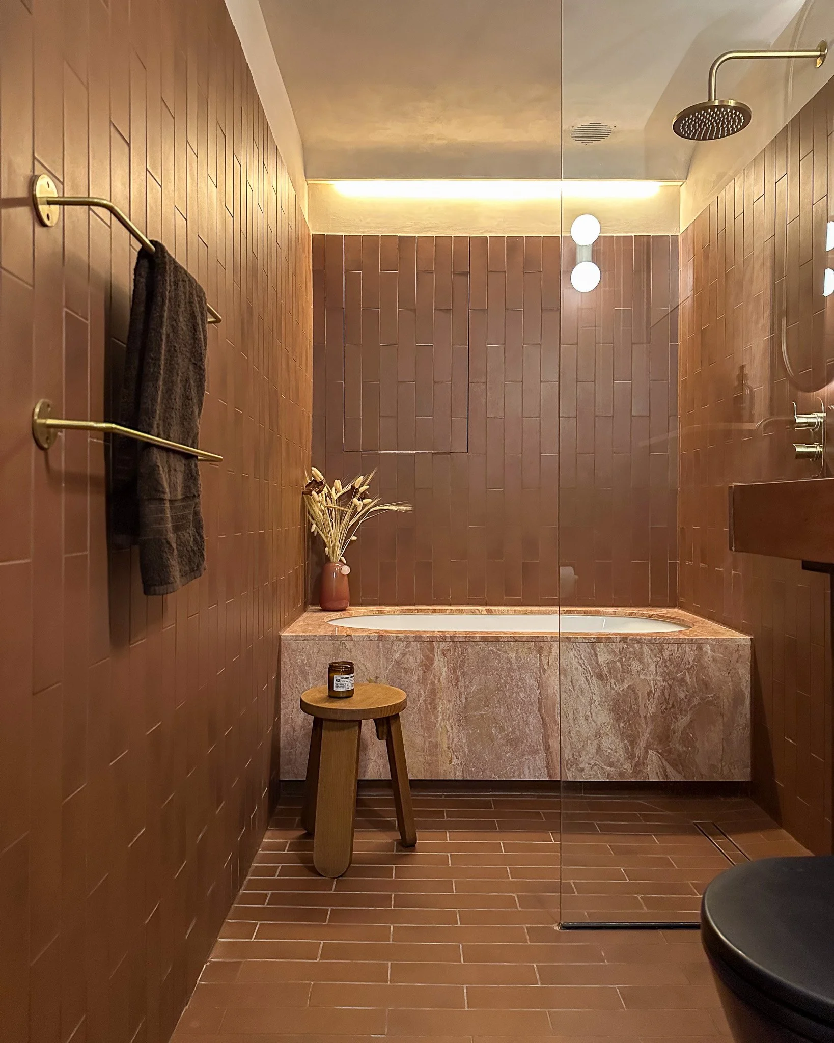
The bathroom sits in the middle of the plan and the brief was ambitious for the area available: a separate bath, a separate shower and a large sink that feels genuinely luxurious rather than apologetic. All three fit, because the storage is distributed into every available cavity — concealed units behind the sanitaryware, full-height joinery above the toilet — so nothing needs to sit out on a surface. “When you’re in the space it feels clean and light and open, so it doesn’t feel cluttered,” Tim says. A terracotta tile wraps the full wall, the bath is wrapped in marble as the room’s main feature, the sink is a terracotta-toned concrete and the joinery is the same dark stained oak as the kitchen, lit deliberately moodily with a horizontal LED strip along the back wall, an illuminated light wall and concealed lighting around the mirror.
A Darker, Warmer Main Bedroom
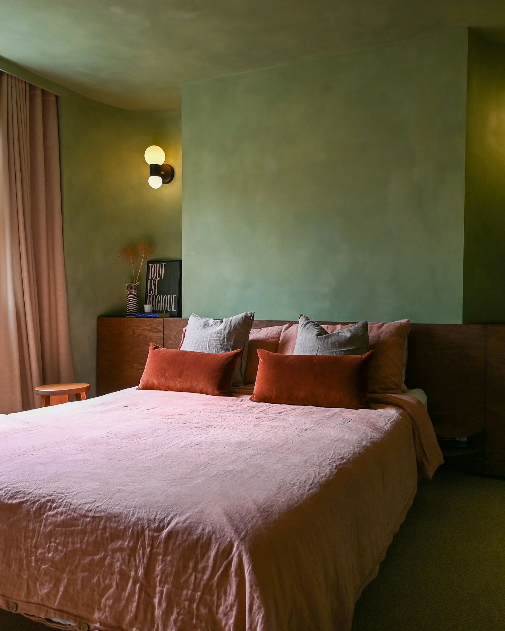
At the front of the house, the main bedroom is the only space that retains broadly the proportions it had in the original property. Soft curves to either side of the alcoves echo those used on the peninsula and columns, and a continuous stained dark oak headboard runs the full width of the room with concealed storage built into it, along with a makeup and dressing space that folds out when needed and disappears when it is not. “Once you’ve folded that away, it still looks beautiful and goes back into the continuous headboard,” Tim says. The plaster finish matches the rest of the house but the colour changes — “to make the bedroom feel a bit different and give a bit more of a retreat, we went for this dark moody green texture” — leaving it warmer and more enclosed than the light-filled spaces at the back of the flat.
A Restricted Footprint, Fully Used
What makes Plaster House worth studying is not the size of the intervention but how completely a restricted ground-floor flat has been worked. A one-bedroom conversion with an outside toilet now has two bedrooms, a bathroom with a separate bath and shower, an open-plan living space organised into distinct zones, a garden studio that doubles as a guest room, and a workshop that’s hidden away. Almost every square metre is doing more than one job, and the consistency of the material palette is what keeps it from feeling busy.
Project Info
Location: Hackney, East London
Architect: Tim Robinson, Director of Sonn Studio
Filmed & Produced by InspireMedia
Written by Dan Burge | Founder of HomeInspire
To see more, watch our full project tour on our YouTube channel!
Share This Story
Get in touch if you’d like to be featured on HomeInspire.
FAQs - Flat Renovations & Extensions
-
Often, yes, though it usually depends on finding light rather than finding floor area. At Plaster House the second bedroom was created by dividing the former rear bedroom and pushing one wall out into what had previously been external space, which allowed an opening vented rooflight to be fitted above the bed. Internal rooms without natural light and ventilation are unlikely to be acceptable as bedrooms, so a rooflight, a lightwell or a reconfiguration that borrows from circulation space is normally the deciding factor. Clearing redundant structure — in this case a boxed-in staircase left over from when the house was a single dwelling — can release more usable space than people expect.
-
A conversation pit is a seating area sunk below the surrounding floor level, usually with built-in benches facing inwards. The appeal is that it increases the apparent ceiling height and makes a room feel considerably larger without altering the roof. The practical considerations are structural and below ground: at Plaster House the adjacent wall had to be underpinned, and because the main sewer runs directly beneath that part of the house, the seating had to be detailed around a live drain without affecting the existing drainage. Anyone considering one should establish the position of drainage runs and foundations before the design is fixed.
-
Traditional terrazzo is a composite of stone or marble chips set in cement or resin, ground and polished to a finish. Jesmonite is a water-based resin and mineral composite that can be cast into bespoke panels and pigmented to order, and it is lighter than cement-based alternatives, which makes it practical as a cladding. Sonn Studio describes the green cladding at Terrazzo Studio as a bespoke terrazzo, and in the film Tim talks about the panels being individually cast to reference green Italian terrazzo. Both descriptions point at the same thing: a made-to-order cast panel rather than an off-the-shelf tile.
-
Some garden buildings fall under permitted development, but the limits on height, footprint, position relative to boundaries and use are strict, and a building intended for sleeping accommodation generally falls outside them. Terrazzo Studio was granted planning permission in 2019. If a garden building is likely to be used as a guest bedroom, a workshop with services, or anything requiring drainage or significant glazing, assume a planning application and check whether building regulations apply to the structure as well.
-
It can be, provided the specification suits the location. Plaster House uses a combination of roughcast and smooth render externally with plaster finishes continuing internally, which is what gives the building its monolithic, carved appearance. Externally, renders need to be correctly specified for exposure and movement, and the colour and texture are integral rather than applied, so repairs need to be patched in sympathetically. Internally, polished and textured plaster finishes are durable but less forgiving than paint if something is knocked, which is worth weighing against the seamless effect they produce.

Plaster House is a ground-floor flat in Hackney designed by Sonn Studio to feel as though it had been carved out of stone. Roughcast and smooth render meet plaster finishes that run inside and out, with a tight earth-toned palette - light wide-panel oak, stained dark oak cabinetry, grey terrazzo - carried through the whole plan. A sunken conversation pit sits beneath the original apple tree, framed from the moment you step through the front door, and a forest green terrazzo studio closes the garden at the far end.