
Mapesbury: Inside Studio Tashima's Woven House Project in NW London
Produced & Written by Dan Burge | 31 August 2026
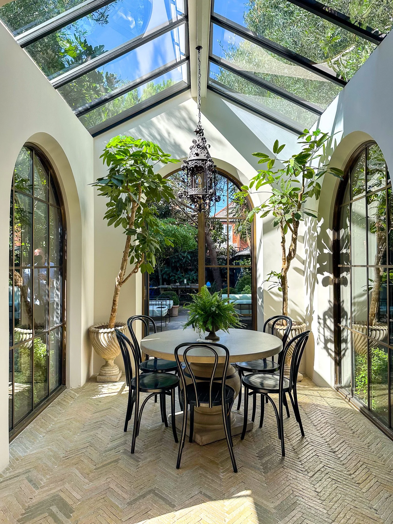
HomeInspire were invited by Studio Tashima to visit one of their projects that they completed a few years ago in the Mapesbury Conservation Area of Northwest London - a two-storey Edwardian semi that Studio Tashima extended and reconfigured for an active, sociable family of four. The brief centred on the ground floor and its relationship to the garden, with the finished house built around three interlocking roof volumes, a reclaimed French antique, and an extension finished in a deliberately contrasting charcoal brick.


Project Overview and Vision
A Brief to Improve, Not Reinvent
The clients had already been living in the house for some time before approaching Studio Tashima, and the project was never about starting from scratch. "Our clients when they came to us had already been living in the house for a while and came to us with the brief of improving the house. It wasn't quite working for them." Rather than clearing the house back to a blank canvas, Charles describes the studio's approach as one of restraint from the outset - retaining what already worked and building outward from it, rather than imposing something unrelated to what was there.
An Edwardian House in a Conservation Area
Dating to around 1890–1910, the house sits within the Mapesbury Conservation Area and carries the arts and crafts and Gothic-influenced detailing typical of the period. "We were very excited about the prospect of working on an Edwardian house, which in itself has some really beautiful moments and it's quite different than a typical Victorian terrace house." That distinction mattered throughout the project — from the tiling and stained glass through to the brickwork — and shaped many of the decisions that followed, particularly once planning and conservation officers became involved.
Designing Around an Active, Sociable Family
With a family that regularly hosts, the priority was flow and openness rather than a series of closed-off rooms. "They're very sociable and they have lots of family members coming and parties. And so with that the primary focus of the work was really on the ground floor and in relationship to the garden." Both clients work in the creative industries, one of them an interior designer, which shaped a highly collaborative design process - Charles describes working through details as small as door handles and mirror placement together with the family throughout.

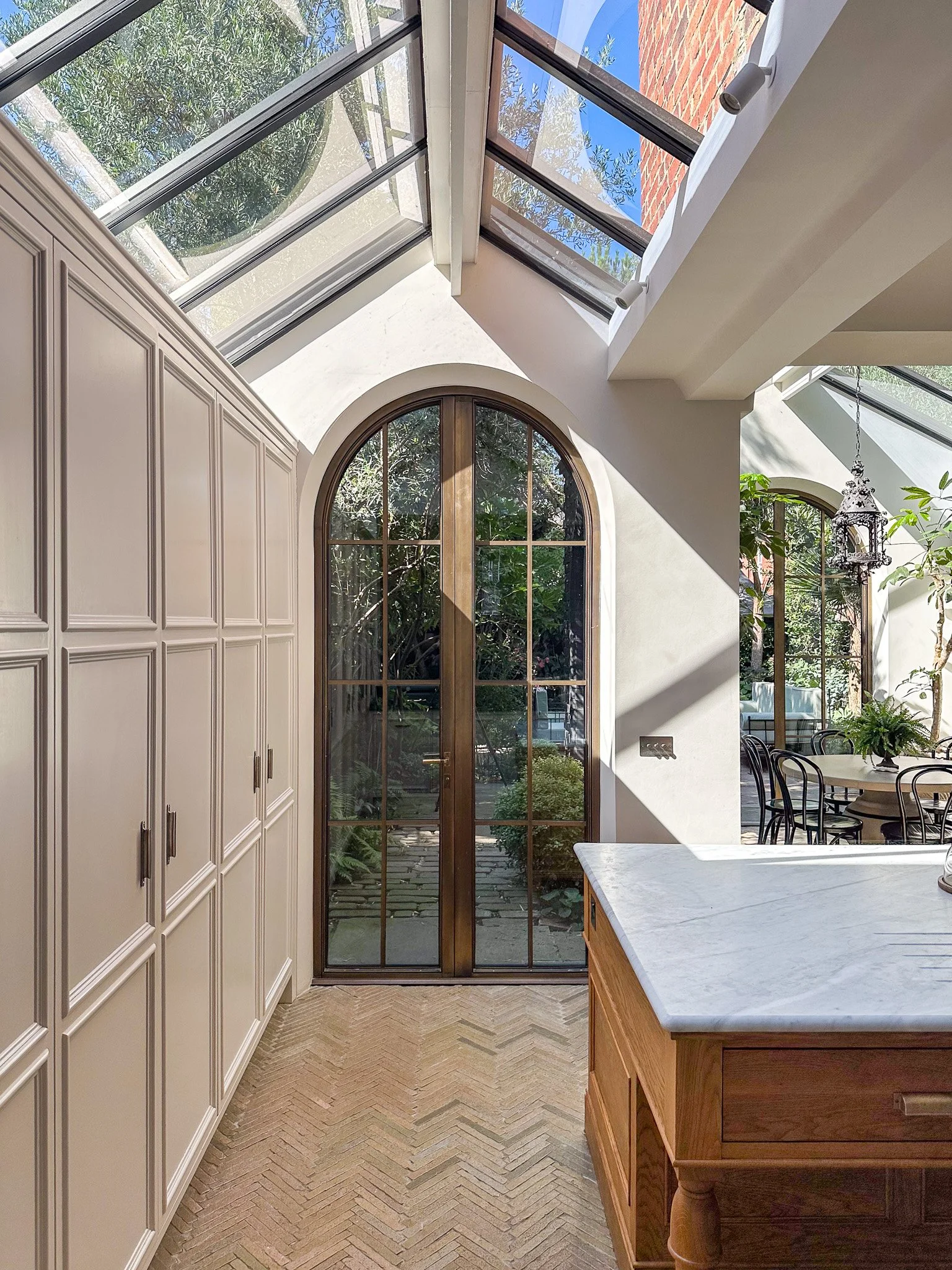
The Ground Floor: Arches, Original Details and a Sense of Flow
Reinstating the Original Character
Wherever possible, original fabric was kept rather than replaced. The house's original staircase was left untouched, and the studio fought to save the entrance hall's traditional tiling. "Sadly, our approach is always to keep and really fight hard to keep the tiles or to keep anything that's original. But it was in such a poor state that we needed to replace them. But we reinstated similar tiles." Stained glass throughout the house followed the same principle - refurbished where it could be saved, and replaced in keeping with the period where it couldn't.
Open Arches and a Sense of Movement
To open the ground floor up without losing its sense of separate rooms, Studio Tashima introduced a series of open arches leading between spaces. "We created these open arches. There's one into the living room that's here and another one that takes you into the main living space... the arch is a really beautiful way to do it because it frames the space in a really beautiful way." The arches also nodded back to the house's original arts and crafts character, tying the new interventions to the period detailing being restored elsewhere.
An Entry Hall Designed With the Clients
The entry hall sets the tone for the sequence of spaces that follows, and its detailing was worked through closely with the family, particularly the interior designer among the two clients. "Even in this instance here, the choice of the mirror and then the seat in the entry hall works so incredibly well with the arches and our ideas that we had in terms of the flow of space going in." The front reception room was deliberately left largely as it was, kept as a cosy, discrete space that the clients led the design of themselves - a contrast to the fully opened-up spaces further back in the house.

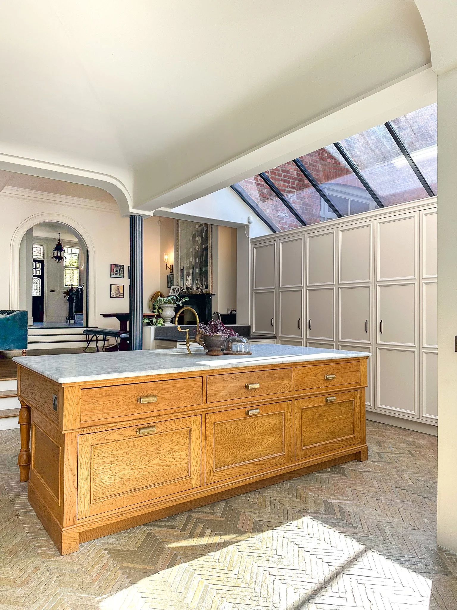
The Extension: Three Roofs, Hidden Steel and a Reclaimed French Antique
Breaking the Volume Into Three
Rather than one large single-storey addition, the rear extension was split into three separate roof volumes. "As we were introducing a fairly large volume, what we did was to break it down into three roofs as a way of then reducing the mass on the exterior." The decision served planning as much as design — reducing the apparent bulk of the addition from outside — while also allowing more natural light into a garden that faces north, a consistent challenge throughout the build.
Two Steel Columns Disguised as Cast Iron
Structurally, the opening onto the garden is supported by two steel columns, originally intended to be reclaimed cast iron. "We wanted to actually put in original cast iron ones, but the engineer wasn't happy with that because he didn't know what the material was in terms of where it came from and its inherent strength." The solution was two round steel columns clad in MDF, painted to replicate the appearance of cast iron — visible today as a subtle change in level within the arch above them.
A 19th-Century French Dispensary Unit
Reclaimed furniture was a fixed part of the brief from early on, and one piece in particular defined the living space. "This is a French dispensary unit from the 19th century. And it fit perfectly within the space. So we were talking about maybe 25mm off from both the ceiling height and the width." It's a detail that speaks to the wider approach on this project — sourcing and designing around a specific found object, rather than treating joinery as an afterthought.
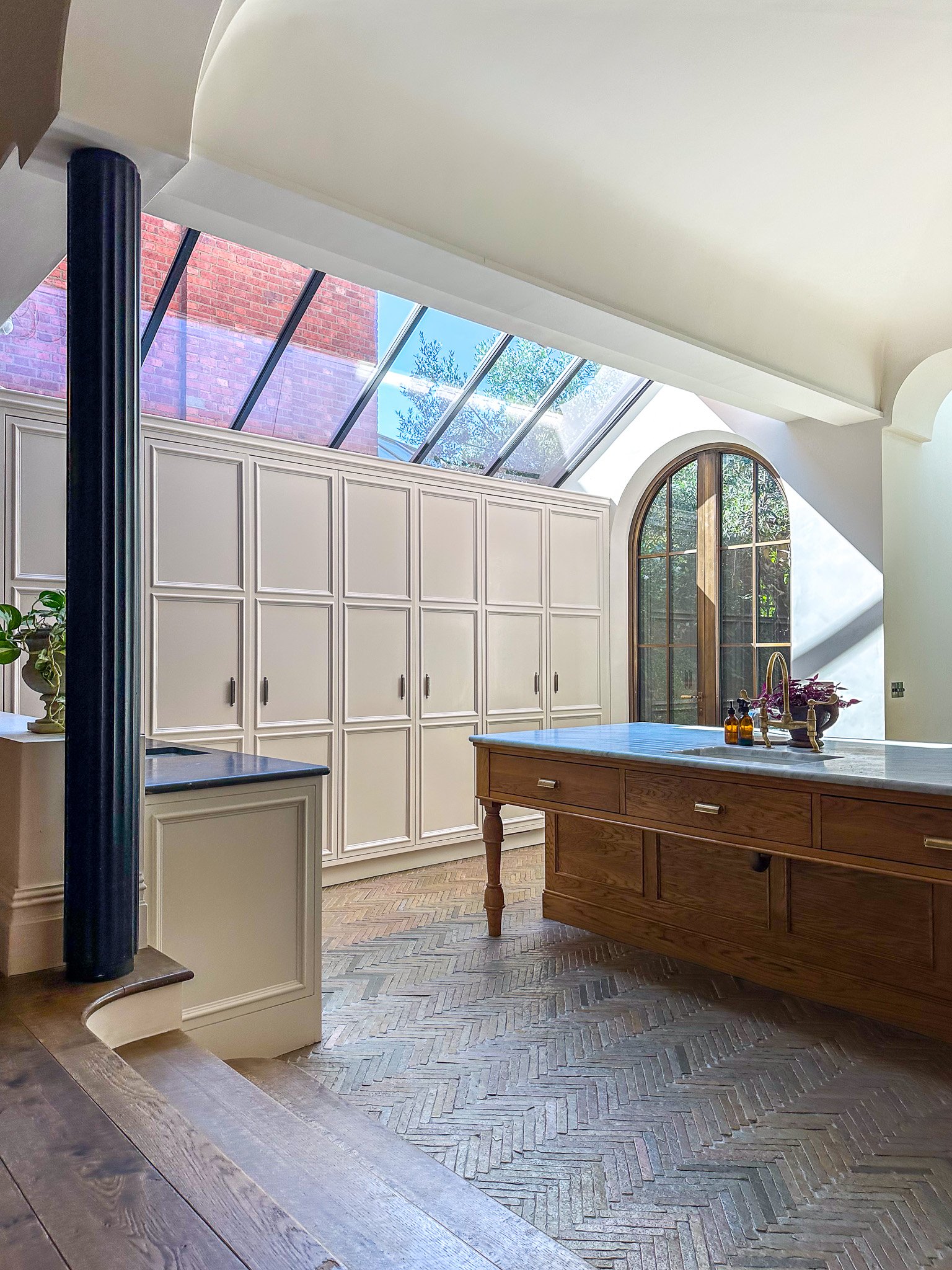

Materials and Details: Stepping Down Into the Garden
A Stepped Floor and a Vaulted Ceiling
Moving from the original house into the new living space, the floor steps down in stages — a decision made for both drama and proportion. "There were two reasons for the stepping down. One was to increase the drama and the sense of volume of this living space, but also for me it's really important that you have this idea of this experience of walking across and then down and then leading you into the garden." Above, the new extension's ceiling takes on a vaulted profile, a detail drawn from an unexpected source. "The vaulted space comes from a photograph that I took in Bologna of a ceiling. And you can see the seams that are coming together."
Different Materials, One Connected Sequence
As the floor steps down through the house, the materials change with it — from the original entry hall through a slate stair, oak flooring, and finally limestone paving chosen by the clients to connect with the garden. "There's the differences of the different rooms, the different materials, but yet they still are completely connected to each other." The result is a ground floor that reads as a single continuous journey while still marking out each room's own character.
The Kitchen Island and a Kitchen That Doesn't Look Like One
The kitchen island's position took considerable trial and error to settle on, balancing several roles at once. "It was about giving a center to the room. It's also a convenient workspace to work within. But also what it enables is that when there's a large party and lots of people walking around, it gives a focal point to that as well." Materials throughout the kitchen were chosen deliberately to avoid a conventional kitchen look. "As a kitchen, we didn't want it to look necessarily like a kitchen... it's almost more like a living space that happens to have a kitchen in it."
HomeInspire Downloads
Download Our Complete Renovation Handbook
A step-by-step guide to planning, designing, and delivering your dream home.
Planning your first renovation doesn’t have to be overwhelming. This 62-page step-by-step eBook guides you through every stage - from budgeting and planning to design, permissions, and finishing touches. Packed with expert advice, checklists, and cost guides, it helps you avoid mistakes, stay on track, and bring your dream home to life.
The Exterior: Black Brick in a Conservation Area
Choosing Contrast Over Matching
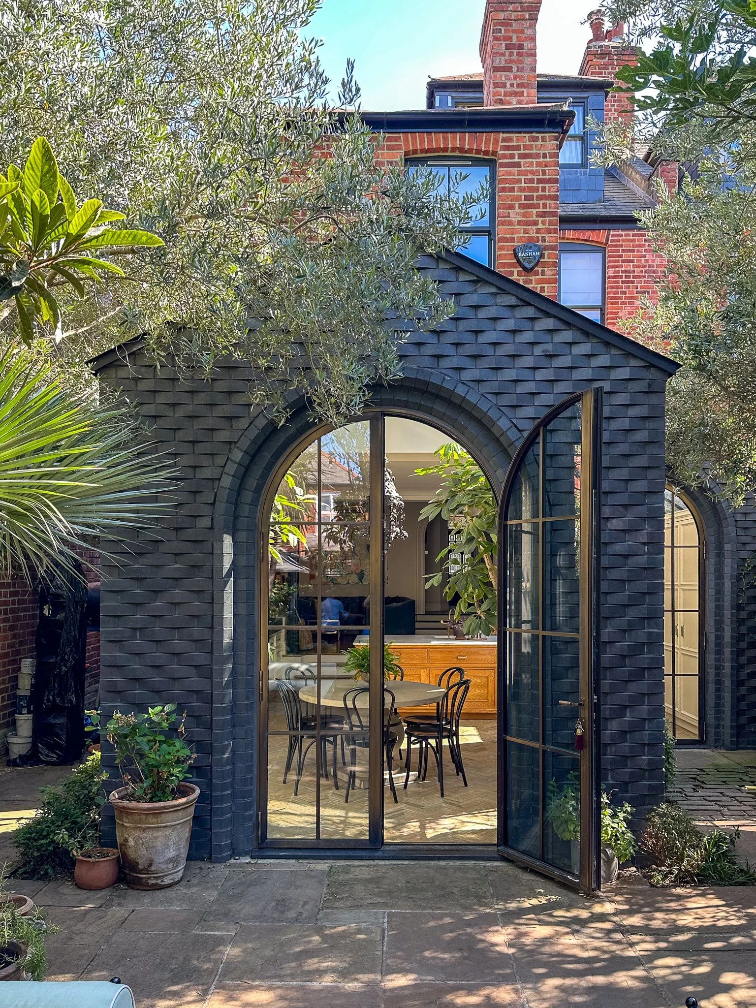
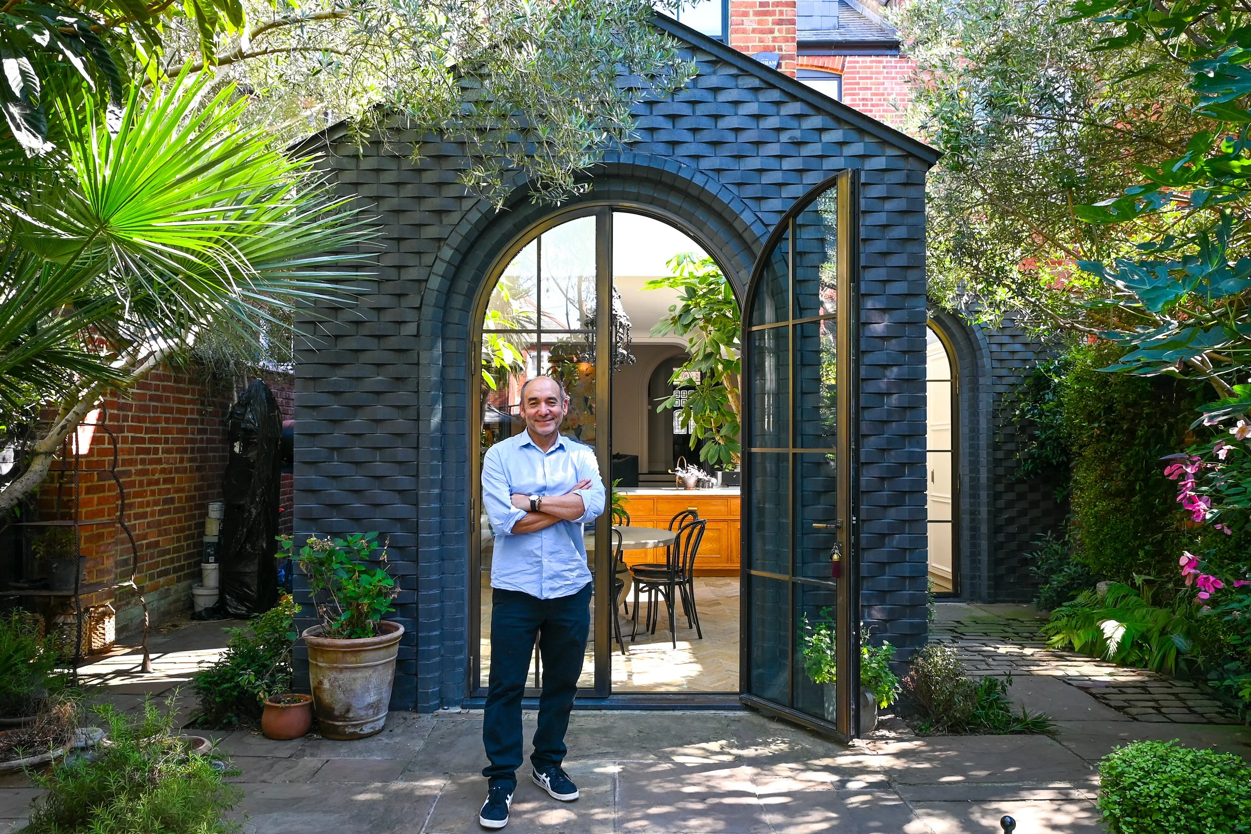
Conservation area planning typically expects new work to match the existing building's materials, and the red brick of the original Edwardian house would have been the conventional choice for the extension. Studio Tashima chose to go the other way. "In our case, we really wanted to make sure that it's has a connection to the garden and not the house. And that's the reason why we chose black. We feel that it's matching in the sense that it's appropriate and it relates to it, but it's not meaning that it's the same as the original bricks."
Bronze Doors and Continuity of Detail
The black brick is paired with bronze doors, chosen partly for how the finish will change over time. "What's really beautiful about it is it patinates over time and has a really beautiful texture, and I think goes really well with the bricks." That same bronze finish carries through to every door handle and light switch in the extension, a small but deliberate piece of continuity that ties the new work together as a single, consistent material language.
Convincing the Conservation Team and the Neighbours
Working within a conservation area, the choice of black brick needed sign-off from the local conservation team — something Charles says was more straightforward than expected. "As we're in a conservation area, it was sensitive, but the conservation team understood it right away and they were then very supportive of our design here." The neighbours took longer to come round. "Of course, the neighbours were not very happy with the idea of black brick, but since it's gone up, they've actually very much embraced it and everyone seems to be quite happy."
A House Built Around How the Family Lives
Looking back on the project, Charles points to the collaboration with the clients as much as any single design move. "I think a lot of it was having to do with a very intense collaboration not only with our clients, who were very involved in the design, but also with engaging with the house, with conservation and the contractor, and getting it all working together in a holistic and organic way." Years on from completion, the house still reflects that process — original character retained wherever it could be, and a bold, contrasting extension built to sit alongside it rather than compete with it.
Project Info
Location: Mapesbury Conservation Area, London
Architect: Studio Tashima
Filmed & Produced by HomeInspire
Written by Dan Burge | Founder of HomeInspire
To see more, watch our full project tour on our YouTube channel!


HomeInspire visited Emilie Mauren of EMR Architecture, and her latest project in Wimbledon, southwest London - a Victorian house that had been split into two dated flats, reworked & converted back into a single family home for a family of four. The brief covered almost every part of the building: a rear extension, a new floor added in the loft, and a garden studio, all threaded together with reinstated Victorian details at the front and a mid-century feel running through the interiors.