
Living in Colour: Interior Designer Natasha's Eclectic East London Renovation
Produced & Written by Dan Burge | 11 October 2026
HomeInspire visited Natasha, an interior designer, at her home in Walthamstow, East London. It’s a Victorian house she bought 26 years ago for £125,000 and has renovated room by room ever since. The result is a colour-blocked, upcycled home with scaffolding board shutters, a yellow rubber kitchen floor, a copper pipe light inspired by the Tube map and a garden with banana trees. Each part of it reflects what Natasha learned from living in the house first and deciding second.
From a Cold, Run-Down House to a 26-Year Renovation
Bought as a “Do-Upper” for £125,000
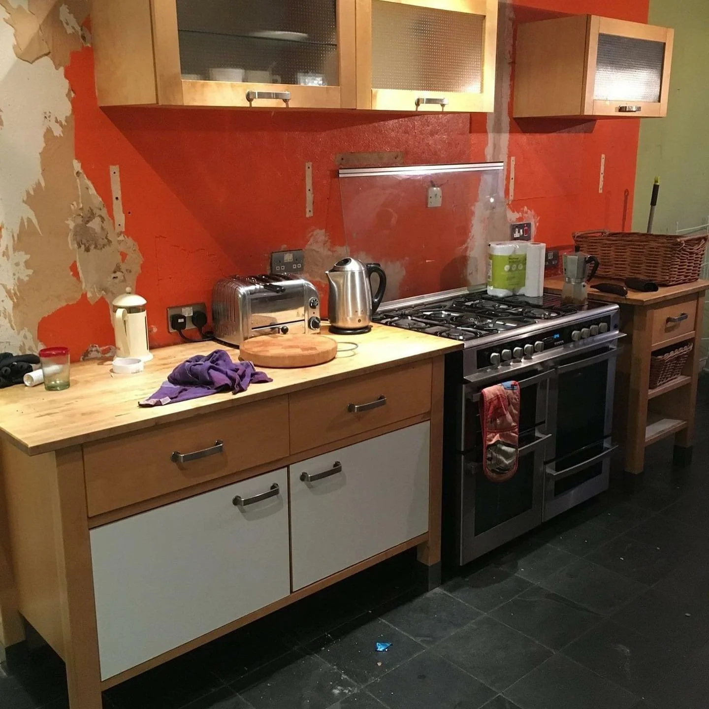
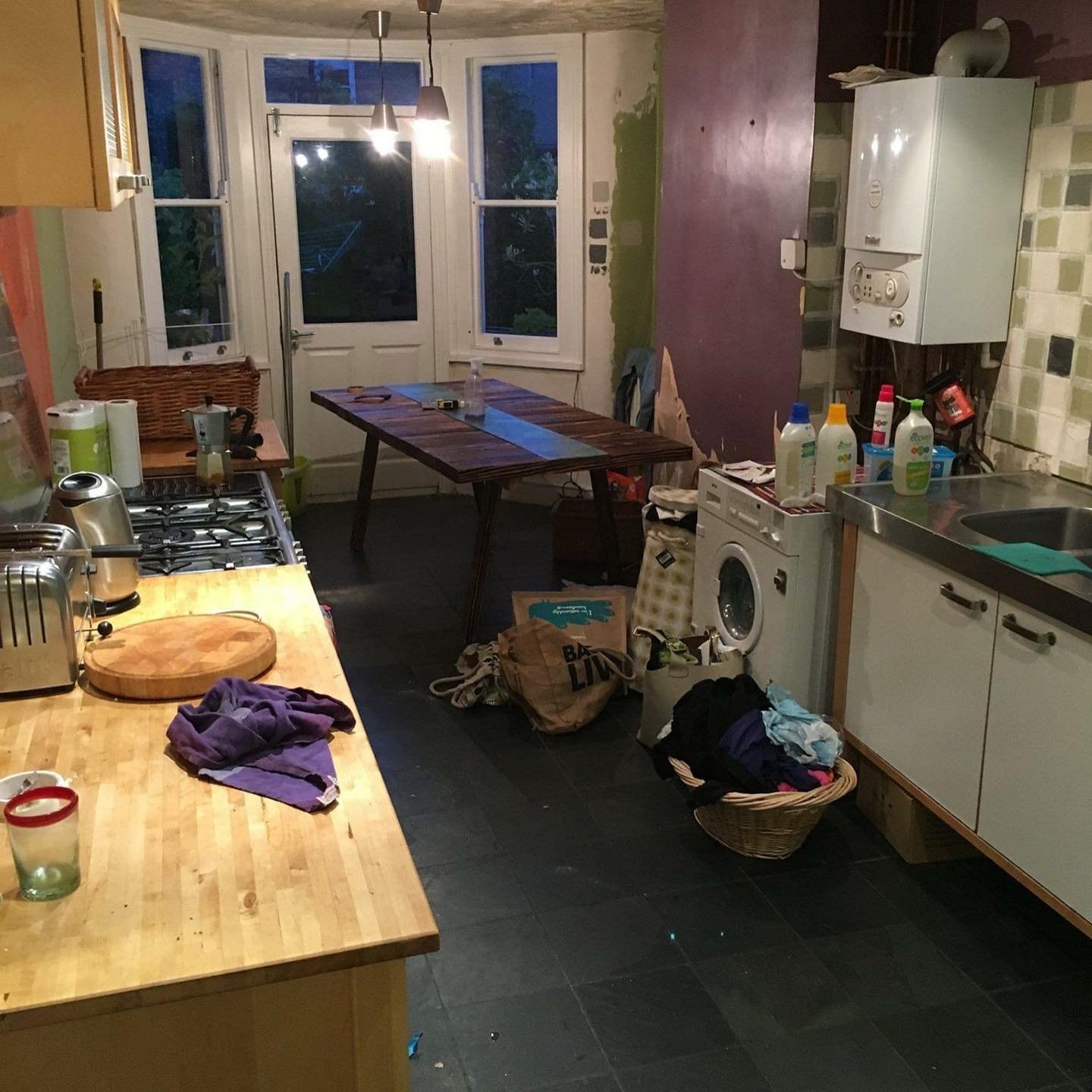
Natasha bought the house in July, 26 years ago. “I can’t believe I’ve been here 26 years.” In those days, she says, it was probably a do-upper, and it cost £125,000. The house was in disrepair and needed upgrading, but it was also extremely cold. The living room is a through lounge, and it had just two single sockets, one at each end. The dividing wall between the two reception rooms had already been taken out, but there was a lot of work still to do.
A House Stripped of Its Period Detail
The coving in the living room had been replaced with polystyrene, the fireplace had gone and the ceiling roses in the hallway were missing. The house kept some original coving and corbels, but mostly, in her words, everything had gone. Natasha put ornate coving back in the living room, which she says was one of the most expensive parts of the renovation. It probably wouldn’t have been this ornate in a Victorian house, but she wanted something that stuck out in terms of the architecture.
A Painted Exterior in Basalt
What attracted Natasha to the house was that it was a Victorian building that had been painted, in a colour called brick red that, she says, looks like neither brick nor red. She couldn’t afford to sandblast it, so the house has always been painted. It’s now basalt, “an inky dark bluey black.” In the front garden, she laid the path tiles a different way to the rest of the garden and added red tiles down the side, which marks it out as the pathway.

The Living Room: Colour Blocked Like an Art Installation
Shutters Made From Scaffolding Boards
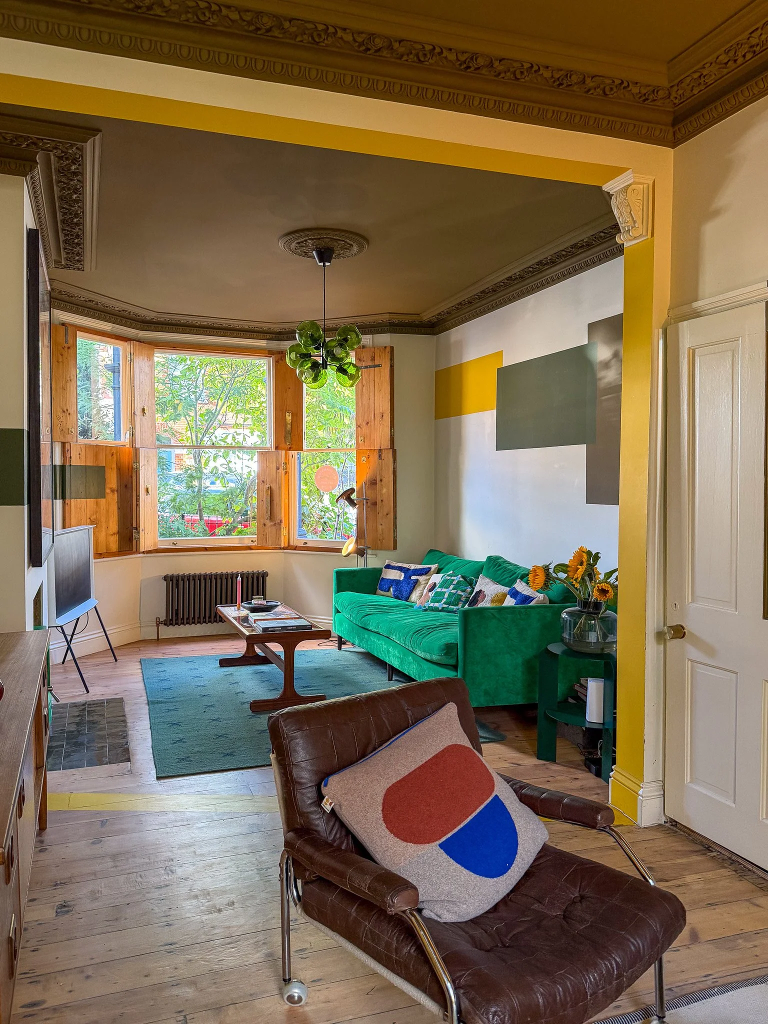
There was no window dressing in the living room before. Natasha liked the old wooden shutters found in some Victorian houses, but she didn’t want to copy them. “It’s never about reproduction. It’s always about being inspired.” The carpenter who had worked on her kitchen suggested scaffolding boards, which are old, thick pine and a lot cheaper than buying new wood. Parts of the shutters still carry the branding of the builders who used the boards before. She also asked him to keep the metal ends of the boards so she could reuse them elsewhere. “He thought I was a little strange, but I knew what I was doing.”
Colour Across Walls, Shutters, Ceiling and Floor
“As a designer, one of my trademarks is colour.” Natasha wanted to colour block as if it were an art installation, so the room would look like it had art on the walls when there was none. Many people think of a feature wall, but “I’m rebellious in terms of the way that I design.” Here, the colour starts on a wall and carries across a shutter, and a stripe of yellow starts on the ceiling and comes down across the floor. Three Little Greene colours are used: olive, light bronze green and Mister David, the yellow. The log burner is a bright green, deliberately different from the walls, and it echoes the outline of a piece of art by Sharon Waters. Opposite is an emerald sofa from Sofas & Stuff that Natasha designed to her own specification.
A Pine Floor, an Angled Stripe and a Calmer Second Room
The floor is the original pine. Natasha wanted it pale, so she had it varnished clear, but pine is an orange wood. “It looked like a Swedish sauna.” It was sanded back and treated with Osmo, which has a hint of white in it. The yellow stripe crosses the floor at an angle. One half of the room is smaller than the other, and a straight line would have accentuated its boxiness, so the angle makes both sides feel the same size. The second half is a calmer space with no TV, filled with mid-century furniture from eBay and Etsy, plus a magazine shelf she bought in Germany because she couldn’t find one in the UK.
The Extension: Planning Options and Light
Two Planning Options, Combined
Natasha renovated the kitchen 10 years ago and found planning harder than she’d expected. Her borough gave her two options. She could go out 6 m from the existing external wall and then across the side return, which many of her neighbours have done. Or she could go out 3 m from the old kitchen, but not across. She did both: 6 m along the side return and 3 m out from the old kitchen.
Sharing the Party Wall and Digging Down
On one side, Natasha agreed with her neighbour to share the party wall, which gave her more internal space. “It’s definitely worth considering when you’re doing an extension.” The neighbour on the other side didn’t want to share, so the walls on that side start further in. There wasn’t much ceiling height, so her builder dug down, and the kitchen is now a little over 2.5 m high in places.
Light, and Doors Found in the Shed
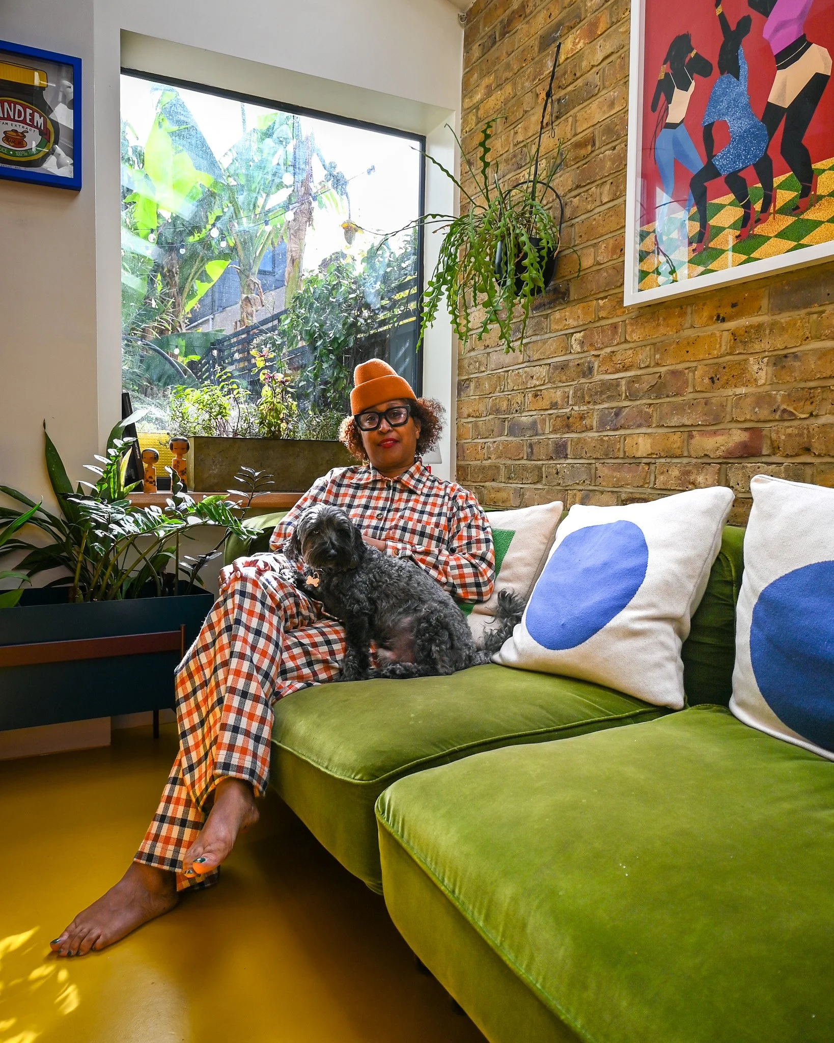
The kitchen faces south and is where the family spends most of its time, so Natasha wanted a lot of light. There’s a picture window at the end, Crittall doors and other windows. She once wanted a glass roof and is glad she didn’t, because the room already feels a bit like a greenhouse. On the way into the kitchen are doors she found in the shed. When she moved in, there was an oversized window onto the side return. “I just knew that there must have been doors.” She added fluted glass and changed the handles.
The Kitchen: Hidden Utility and Industrial Materials
A Utility Cupboard Behind a Door
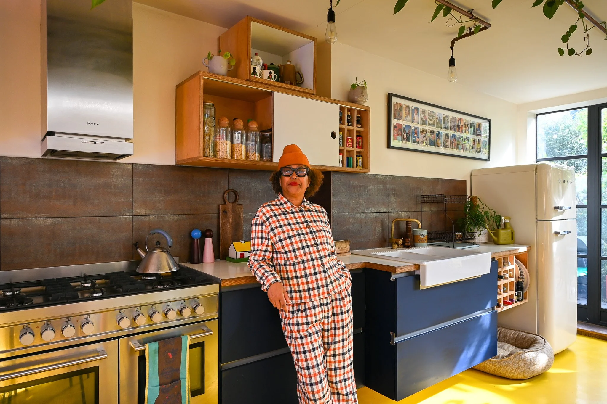
Natasha wanted floating drawers, so there was no room for a washing machine or dishwasher in the kitchen. Her plumber put them in a utility cupboard on the other side of the toilet under the stairs. People often assume the door leads to the toilet. Behind it is an electric blue by Mylands, a colour she’s using around the house at the moment.
Reclaimed Brick, Copper-Look Tiles and an Ideal Home Bargain
She wanted the kitchen to look industrial and rustic. One side uses old stock bricks, and the other uses Fired Earth porcelain tiles that look like copper. She used floor tiles rather than wall tiles on the walls. “Use floor tiles rather than wall tiles if you want to create that illusion of space.” The main bank of drawers came from the last day of the Ideal Home Exhibition, when companies sold displays cheaply. “I think I should have paid something like £12,000 and I paid £3,000.”
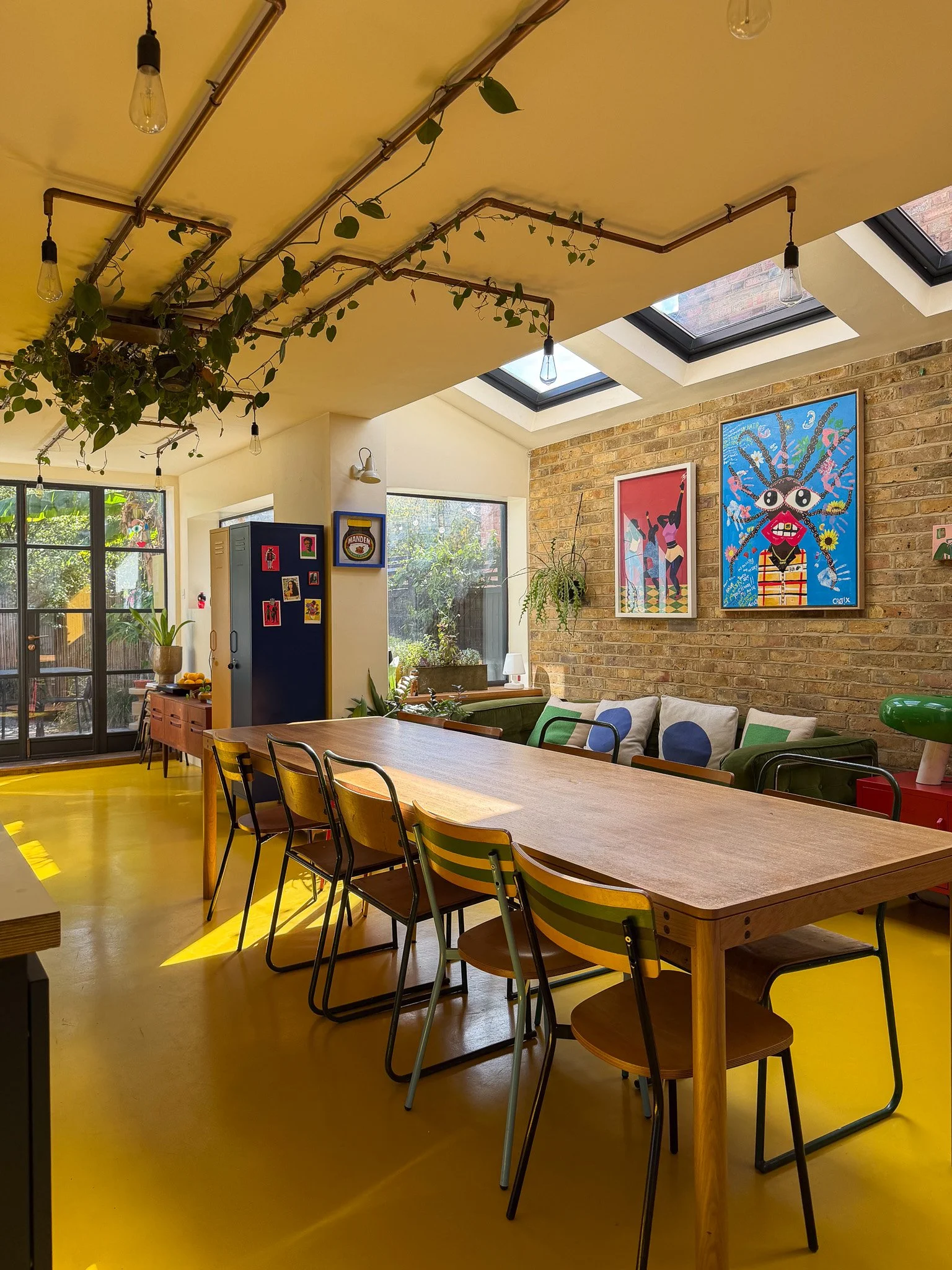
The Yellow Rubber Floor and the Copper Pipe Light
Rubber Instead of Concrete
Concrete was out of Natasha’s budget, so she looked at rubber from The Colour Flooring Company. “As soon as I got the sample, I absolutely knew it had to be yellow.” Even on a dull day, she says, it makes the room look like there’s sunshine in it. It’s warm underfoot and works with the underfloor heating, but it has to be laid professionally on a very flat floor.
A Copper Pipe Light Inspired by the Tube Map
The architect’s drawings included spotlights. “Spotlights are my bugbear.” Instead, she took an idea from a café light fitting made of copper pipes that she found on Pinterest, and based her own loosely on the London Underground map. Some of the joints aren’t soldered, so an electrician can take parts of it apart if needed. A few years ago, she started adding plants to soften it, and her aim is for them to cover the whole ceiling.
HomeInspire Downloads
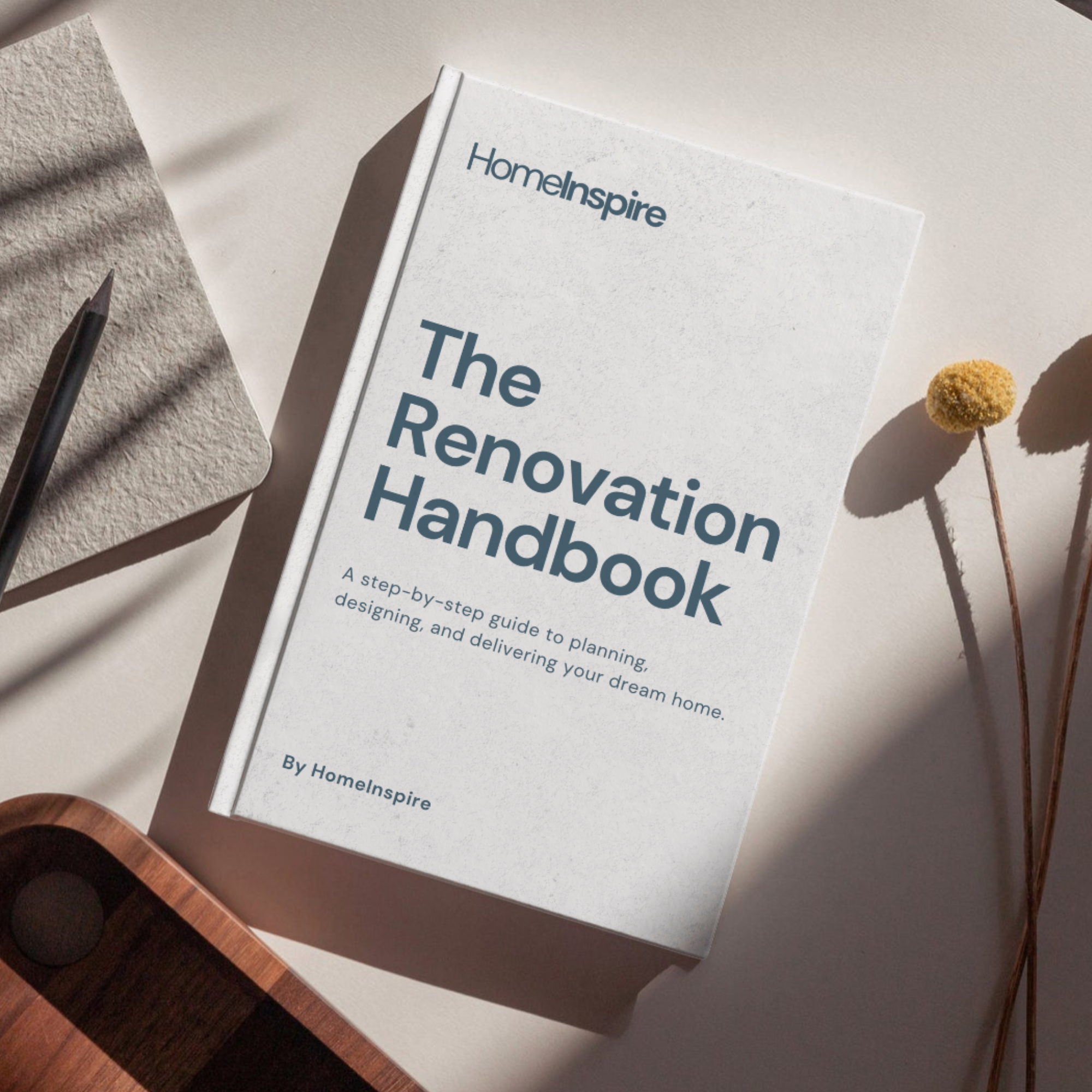
Download Our Complete Renovation Handbook
A step-by-step guide to planning, designing, and delivering your dream home.
Planning your first renovation doesn’t have to be overwhelming. This 62-page step-by-step eBook guides you through every stage - from budgeting and planning to design, permissions, and finishing touches. Packed with expert advice, checklists, and cost guides, it helps you avoid mistakes, stay on track, and bring your dream home to life.
What 26 Years of Renovating Taught Her
Why It Took 26 Years
“I would say my renovation has taken 26 years.” Part of that is money, because she was saving for different parts of the house. The other part is living there and seeing how it works for her.
Live in the Space First
Natasha gives her interior design clients the same advice. “Live in a space for a little while to see how you use it, which room you’re going to use the most, how you’re going to use those rooms, how the light falls.” People often want to start decorating straight away. “That can be an expensive decision when it’s the wrong decision.”
Project Info
Location: Walhamstow
Owner & Interior Designer: Natasha Landers
Filmed & Produced by HomeInspire
Written by Dan Burge | Founder of HomeInspire
To see more, watch our full project tour on our YouTube channel!
Share This Story
Get in touch if you’d like to be featured on HomeInspire.
FAQs - Planning Permission & Colour Blocking
-
Under permitted development in England, a single-storey rear extension can usually extend up to 3 m from the original rear wall, or 4 m for a detached house. Larger single-storey extensions of up to 6 m (8 m for detached) can go through the prior approval process, where your neighbours are consulted. These rights don’t apply everywhere. Conservation areas, listed buildings and homes with an Article 4 Direction have extra restrictions, so check with your local planning authority first.
-
You usually do if the work involves building on or at the boundary with a neighbour, or digging foundations close to their property. Under the Party Wall etc. Act 1996, you have to give your neighbour written notice before starting, and they can consent or dissent. Planning permission or permitted development doesn’t replace this. If your neighbour agrees to share the party wall, you can sometimes gain more internal space, but you should agree it in writing.
-
Yes. Rubber flooring is durable, warm and comfortable underfoot, and it comes in a wide range of colours, including bold ones. It needs to be laid on a very flat subfloor, so it’s best fitted by a professional. It’s also worth asking the supplier about maintenance and cleaning before you commit.
-
Generally, yes. Many rubber floors are designed to work with water-based underfloor heating, and they feel warm underfoot. Always check the manufacturer’s guidance on maximum floor surface temperature and on how to bring the heating up gradually after installation. Your installer should check the subfloor is suitable before they start.
-
Pick two or three colours that work together, then decide where each block starts and stops before you pick up a brush. Colour doesn’t have to stop at the corner of a wall. It can carry across a shutter, up onto the ceiling or down across the floor. Use masking tape for sharp edges, test large swatches in different light, and live with them for a few days before committing.
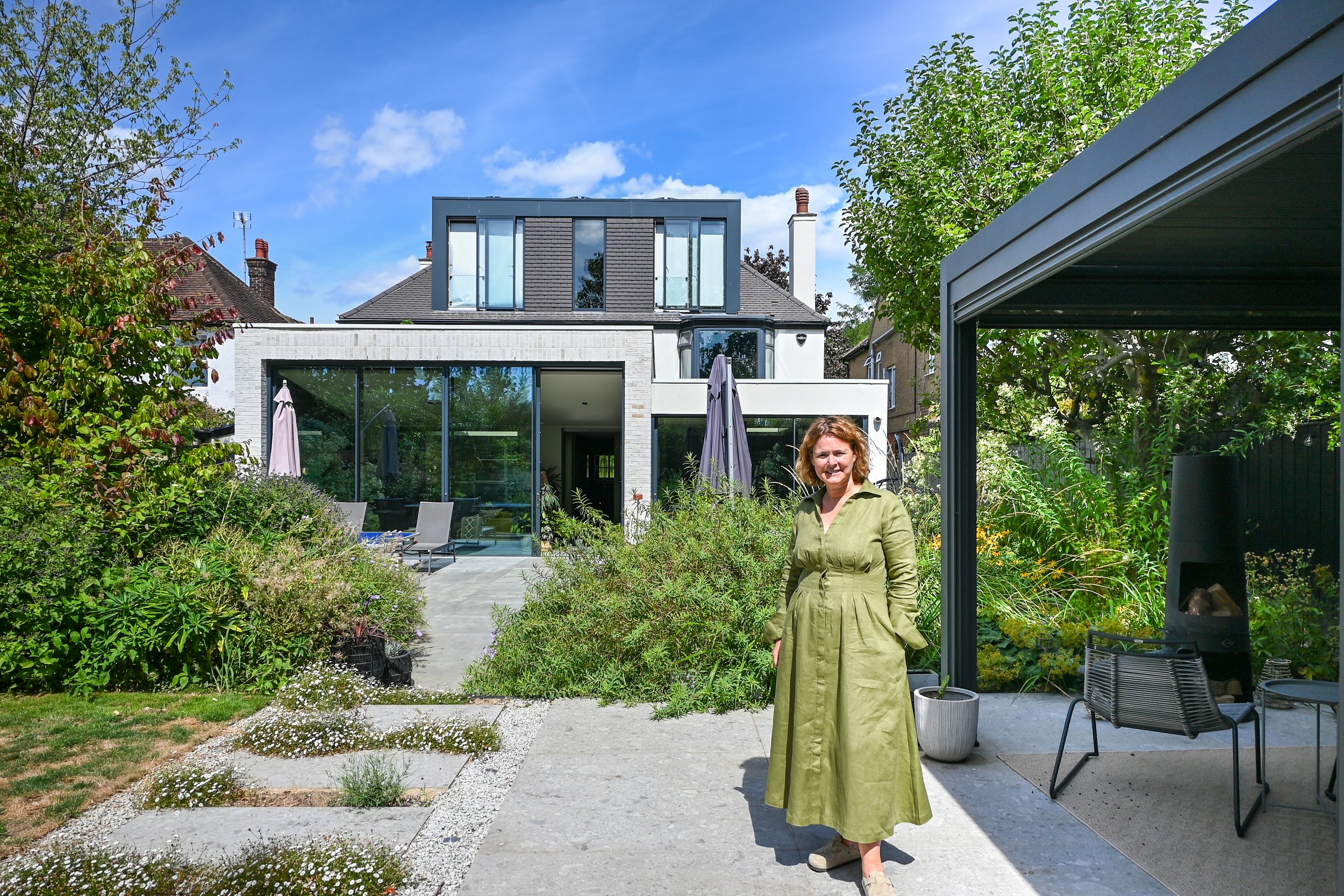
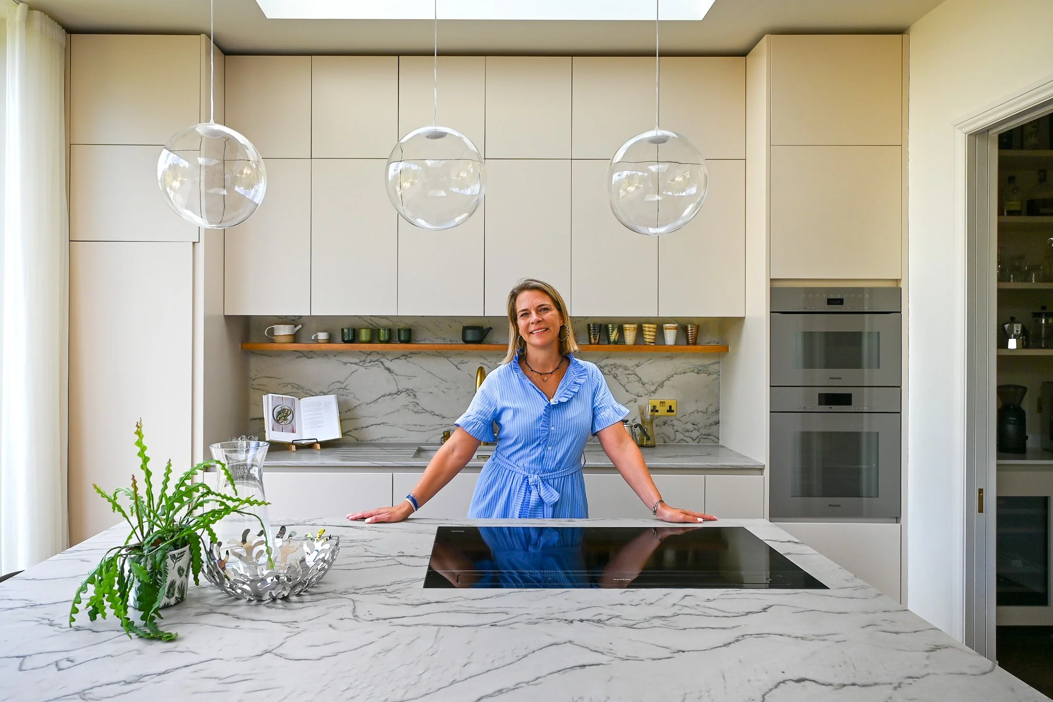

HomeInspire visited interior designer Natasha and her own home in Walthamstow, East London - a Victorian house she bought 26 years ago for £125,000, extended by 6 m along the side return and dug down for extra ceiling height, then colour blocked across walls, shutters, ceiling and floor. With shutters made from scaffolding boards, a yellow rubber kitchen floor and a copper pipe light inspired by the Tube map, the renovation has been built up room by room, turning a cold, run-down house into a home shaped by how Natasha actually lives in it.