
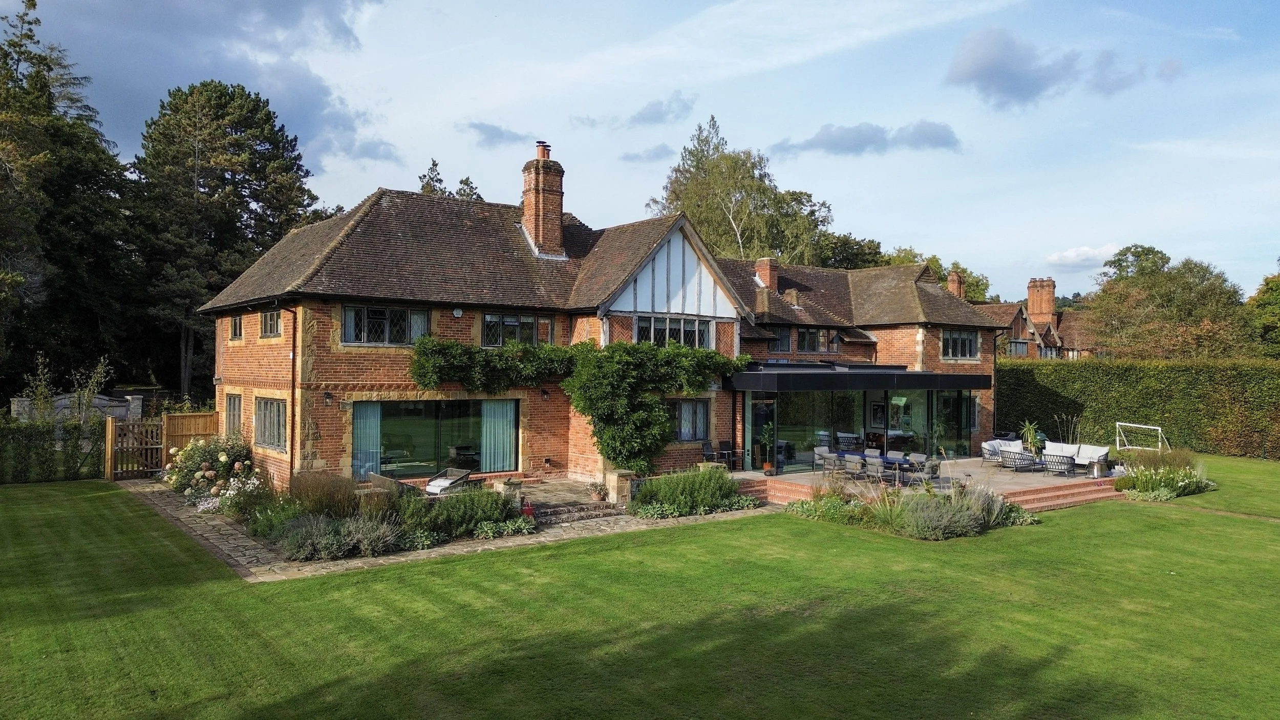
Hartwood, Surrey Hills.
Inside a Modern Country Home by Claudia Dorsch Interiors.
We were invited to film this project with Claudia Dorsch Interiors in September 2025, capturing one of her most striking recent transformations - a complete redesign of a traditional country house in the heart of the Surrey Hills.
In this feature, we step inside a home that balances heritage and modernity - where bold contemporary design meets the warmth of a timeless family residence. What was once a dark and compartmentalised Tudor Revival house has been reimagined into a bright, open-plan home, surrounded by nature and flooded with light.
Across this tour, Claudia shares how she approached the project from the ground up - reconfiguring the flow, layering textures and tones, and introducing modern detailing while preserving the home’s soul.


Defining the Brief
The house itself blends architectural eras, originally built in the 1930s but later extended in different styles. As Claudia explains, “There are many stylistic elements, arts and crafts mixed in as well.” But when she first visited with the clients, the potential was buried under decades of incremental changes: “We found a property that was very dark, chopped up with different buildings and it really lacked the immense opportunity… to enjoy the outdoor views.” The owners wanted a forever home, and to achieve that, Claudia and the architects were given “the license to completely reshape the interior architecture of the building,” opening spaces, modernizing circulation and adding an ambitious new extension.
Transforming the Flow
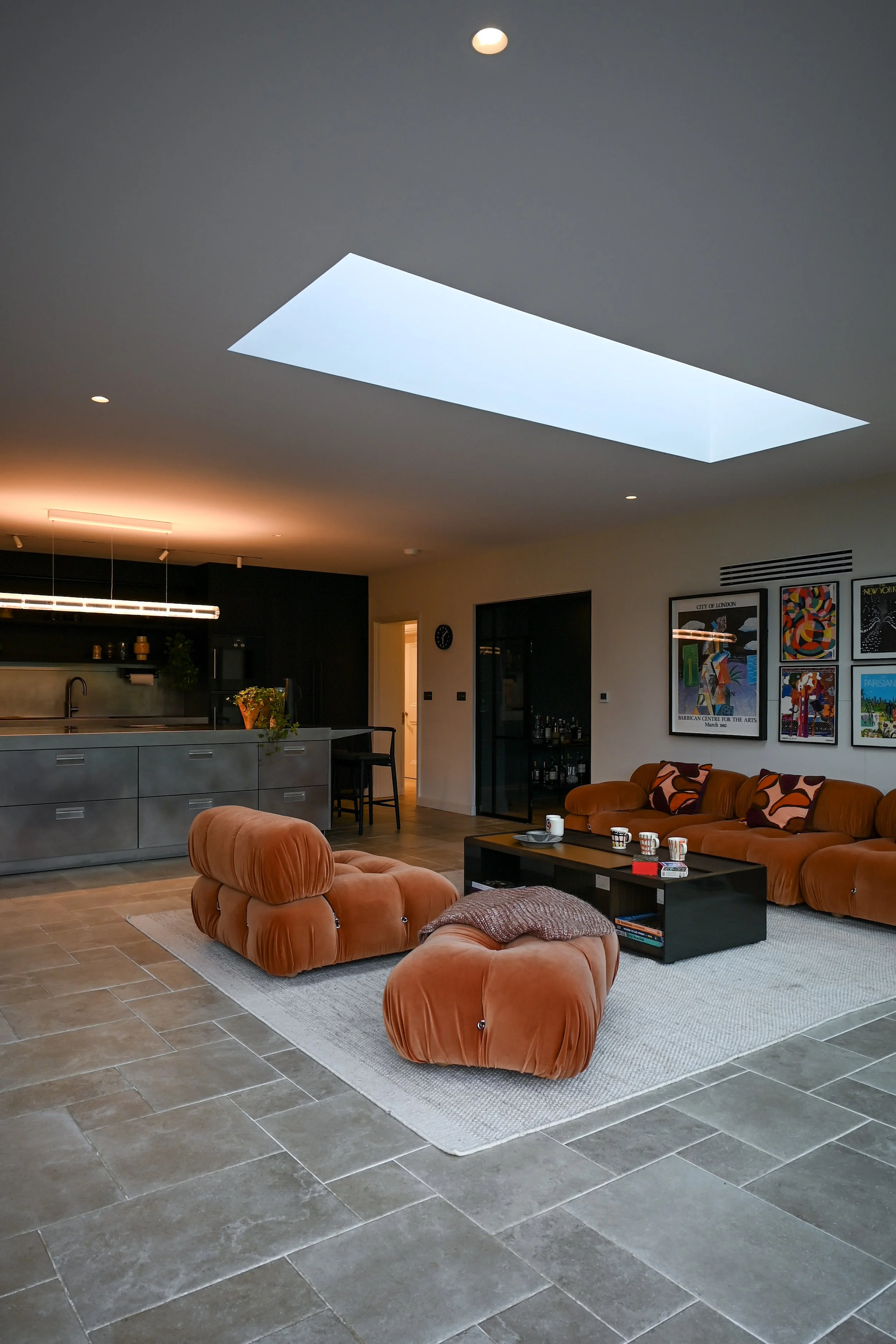
Working in collaboration with local architects, Claudia and her team reimagined the ground floor layout entirely. A new open-plan kitchen, dining and living space now forms the heart of the home - a generous area where light floods in through ultra-slim sliding doors and skylights.
The extension subtly connects the house to its natural surroundings, while a pair of symmetrical adjoining rooms - a family snug and a library - create balance and flow. Throughout the plan, Crittall-style glazing introduces rhythm and visual continuity, while practical utility spaces are hidden seamlessly behind the scenes.
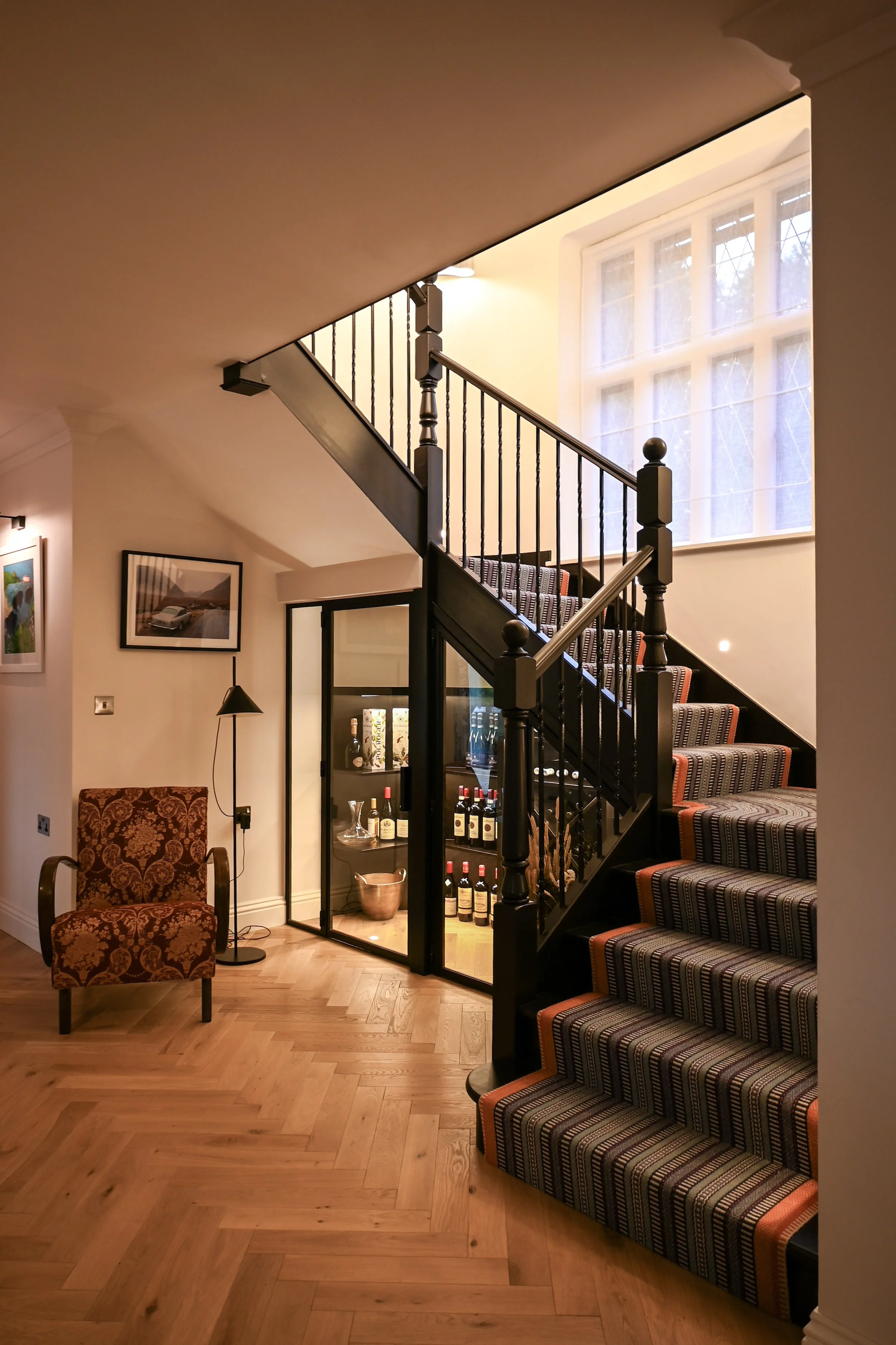
In the entrance hall, it perfectly demonstrated the structural transformation and the methodical design philosophy behind the project. The hall had been constrained by years of alterations: “This was a very dark space. The ceiling was all chopped up and had different beams running through it.” To recover grandeur and light, the ceilings were levelled and raised, walls were rationalized, and new crittall-style glazed doors introduced sightlines and brightness. Claudia explains, “We created one big open entrance hall and… increased the ceiling height, and that made a big difference.” Even the staircase was opened up to introduce transparency: “The staircase was previously a solid banister… hardly any light coming into this space. So we completely stripped this back.” The result is an arrival space that feels contemporary, elegant and cohesive.

The Kitchen: Refined and Dramatic
The kitchen is both a showpiece and a workhorse. Designed in collaboration with Arclinea, it’s a study in contrasts - black rough-sawn oak, leathered black lava stone, and polished stainless steel sit against sand-coloured flagstone-effect flooring.
A concealed butler’s pantry hides preparation and storage zones, ensuring the main kitchen remains calm and sculptural. It’s an environment that feels robust yet refined - a perfect reflection of Claudia’s modern country aesthetic.
The extension is the architectural centerpiece. Claudia gestures to the roof glazing and floor-to-ceiling sliding panels, explaining, “All of this is an extension and the space is flooded with light from above.” The glazed doors, designed by Li2 Designs, transform how the home interacts with its surroundings, offering panoramic views of “the beautiful grounds, the lake, the swimming pool, big terrace.”
Even the kitchen floor solves a practical challenge without compromising aesthetics. Natural stone was the ideal look, but maintenance concerns led to a pragmatic alternative: “We found these beautiful flagstone-looking tiles from Mandarin Stone… if you didn’t know they’re porcelain, you would think they’re stone.”
Designing for Light
Lighting played a huge role in this transformation. Claudia points out that the new scheme allows the family to shape ambience throughout the day: “We’ve introduced a chandelier that gives off a lot of light… modern wall lights and these low-level spots that run along the staircase… different circuits all can be dimmed at different times of the day.” Colour also begins here - a runner in blue, orange and pink echoes a crucial creative starting point. As she explains, “We often start a project with either a particular artwork or a fabric… the clients found one particular fabric… and this really set the tone… these colors flow throughout the house.”


Suite Comforts: Bedrooms and Bathrooms
Upstairs, five principal bedrooms and their en-suite bathrooms continue the architectural realignment and design continuity. The hallway once felt narrow and segmented, but now “we really opened up again this corridor… to create a really large open space.” Many bathrooms had not been touched in decades, and modernizing them required complete rethinking: “We have completely modernized, changed the layout, introduced all the modern sanitaryware.” Each bedroom carries its own palette while still belonging to the same family of tones.
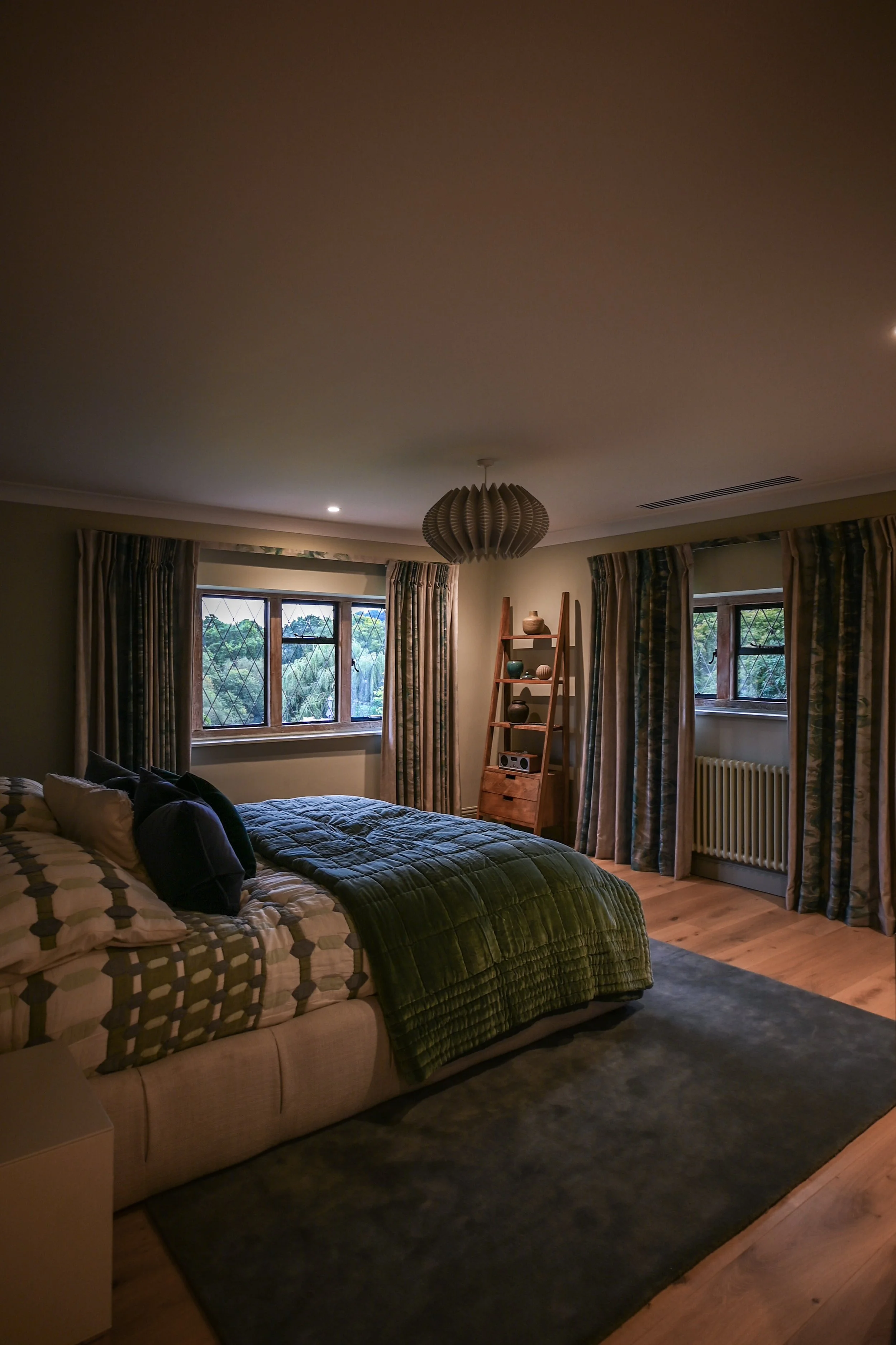
The master suite demonstrates the full ambition behind the renovation. Claudia and the team set out “to create something like a luxurious hotel suite,” retaining original façade windows but reworking all internal walls to produce comfortable proportions and strong architectural logic. The bedroom combines muted teals, blues and sand tones, part of the color system that runs “throughout the house and throughout this bedroom and then the bathroom.” Lighting was planned at a technical level as well as a lifestyle one, ensuring rooms are “futureproofed… wired for switches and sockets and USB-C plugs.”
The adjoining dressing room is a standout moment, designed as one uninterrupted wardrobe suite. “We dedicated an entire room as a walk-in wardrobe,” with daylight from two windows and open shelving units — no doors required because “the room itself can be closed off.” The master bathroom continues the language of natural-looking materials with modern practicality. Claudia explains, “The flooring looks like it is stone, it actually is porcelain tiles,” while the shower uses “beautiful tiles from Artisans of Devises that look like marble.” The scheme balances a contemporary veneer vanity, handcrafted joinery and a freestanding bath finished in a muted clay tone that “picks up… tones in the tiles and in the wood altogether.”
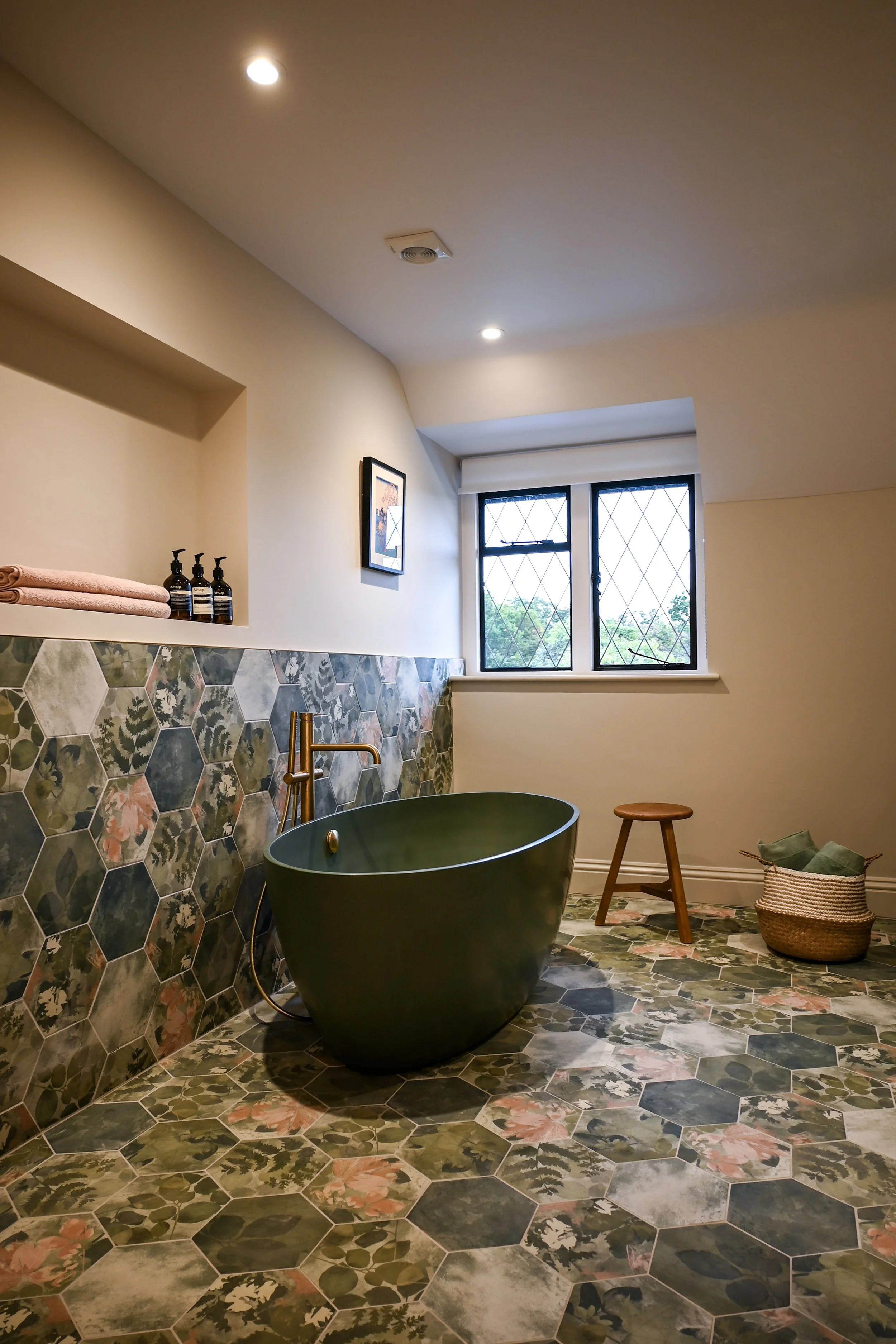
Across the house, seven bathrooms were designed in total, allowing Claudia’s team to explore different moods and combinations. In a modestly playful aside she notes that one in particular “really takes the top in terms of fun tiles,” featuring hexagonal patterns, greens, florals and even a matching green bathtub and joinery.
A Room with a View
The main living room epitomises the project’s spirit - modern, comfortable, and full of light. Oversized sliding doors frame views of the garden, while a Calacatta Vagli marble fireplace by Chesneys anchors the room with quiet elegance.
Custom bookcases painted in a soft violet tone complement the marble’s natural veining, introducing Claudia’s signature play on colour and symmetry. The furnishings are deliberately minimal, allowing the architecture, and the view, to take centre stage.
Modern Hideaways
From the kitchen, new crittall-style doors link into two family rooms - the library and the snug - both designed to offer comfort and purpose. The library demonstrates how layout rationalization can completely shift atmosphere. Previously, “there used to be a door from the main entrance hall, a door from the kitchen, and… a door to the garden,” resulting in cross-circulation and awkward pathways. By closing two openings and enlarging the third into a glass feature doorway, “we created a space that would be really cozy, quiet for homework, music practice, reading, working from home.” Bespoke black-oak joinery provides a balance between display and concealed storage - as Claudia notes, “It’s great to have the option of putting things away but also having nice things on display.” Their decision to retain original 1930s windows keeps heritage visible even within the new contemporary shell, and Claudia adds that by improving symmetry and light, “we improved the flow and the spaciousness of the spaces.”
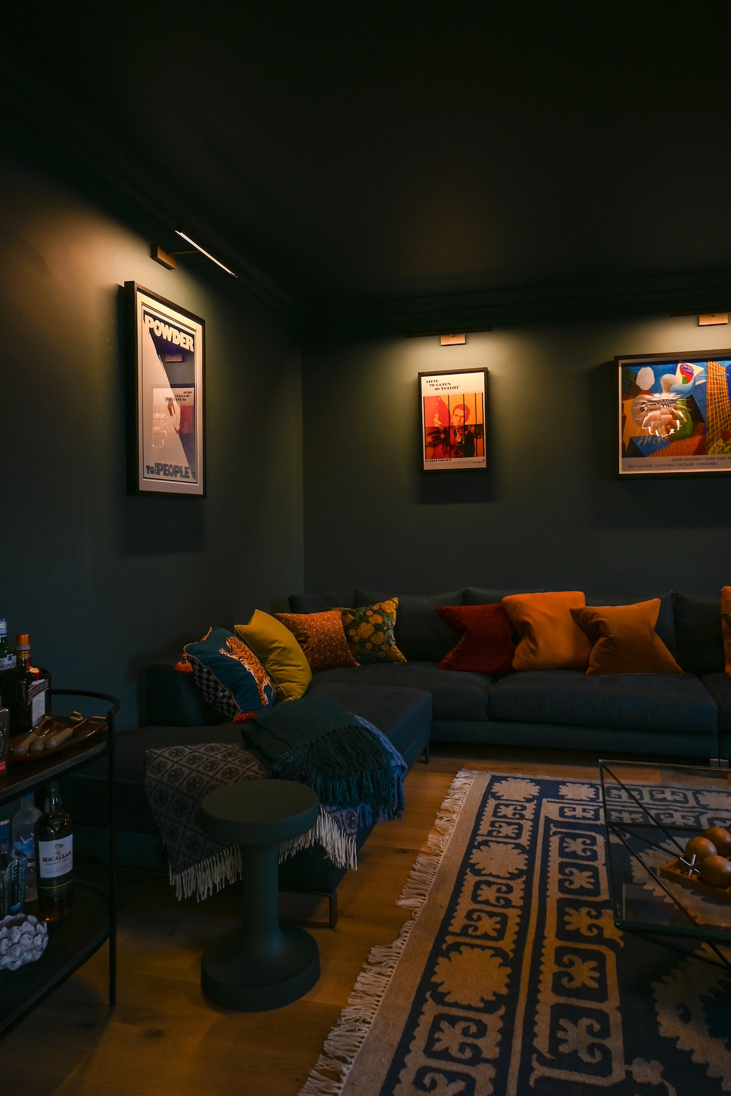
Next door, the family snug takes the opposite approach, embracing immersion and darkness. “This room we designed in a way to be dark and really cozy and really comfortable,” with walls and ceiling painted in a deep blue that matches the large B&B Italia corner sofa. Instead of downlights, the room uses “cozy lighting… a beautiful artichoke chandelier and some really nice picture lights,” supporting the clients’ commitment to showcasing art.
Anything but the Downlight
Lighting is often the unsung hero of great design, and here it takes centre stage. From recessed LED floor washers to statement chandeliers by Flos, every circuit was considered to transform the mood from day to night.
The staircase alone features six lighting layers - each creating depth, drama, and warmth. Throughout the home, wall lights, picture lights, and pendants were chosen to complement the mix of old and new, enhancing the home’s quiet modernity.

Project Credits
Interior Designer: Claudia Dorsch